
Project Overview
The Green Fixed Deposit (FD) initiative focused on transforming a regulated, legacy financial product into a modern, accessible, and trust-led digital experience. The objective was not visual modernization alone, but the establishment of a governed product experience system that could scale across channels while meeting regulatory, accessibility, and brand standards.
This program required balancing user comprehension, regulatory disclosure, sustainability storytelling, and enterprise constraints, while ensuring decisions were auditable, consistent, and future-ready.
Context & Mandate
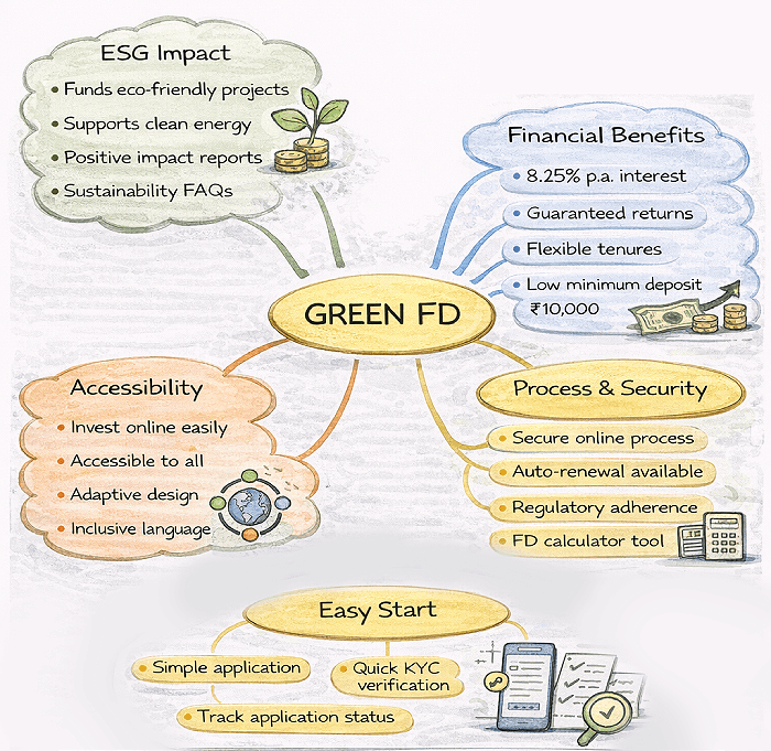
Green FD is a high-trust, long-term financial product, often used by conservative and senior users. The existing experience was disclosure-heavy, cognitively demanding, and optimized for compliance rather than understanding.
-
The mandate at leadership level was to:
- Redesign the experience as a service users can understand and trust
- Establish UX governance suitable for regulated products
- Reduce ambiguity without compromising compliance
- Sign off on a design system that could sustain future iterations
Role & Accountability
I owned the strategic direction, experience vision, and design principles across the program, establishing UX governance, accessibility standards, and decision frameworks aligned to regulatory and business needs. I directed research, design, and validation efforts to ensure consistency and scalability across internal teams and external vendors, and reviewed, approved, and signed off on all critical experience decisions prior to release, with full accountability for long-term product quality.
-
Responsibilities included:
- Defining the end-to-end product UX strategy
- Establishing UX guardrails aligned to regulatory and accessibility standards
- Directing research, design, and validation activities
- Governing vendor and internal execution quality
- Reviewing and approving all key experience decisions before release
My role extended beyond execution into decision frameworks, prioritization, and system-level accountability.
Problem Definition
- Dense financial language increased cognitive load
- Sustainability value was unclear and abstract
- Users struggled to interpret returns and tenure
- Accessibility gaps affected senior and low-vision users
- The journey optimized for disclosure, not understanding
Design Responsibility (Leadership Lens)
TInspired by public-sector UX principles, the redesign approached the Green Fixed Deposit experience as a service with a duty of care, rather than as a marketing or promotional surface. Given the financial and long-term nature of the product, the design responsibility extended beyond enabling transactions. It required ensuring that users could understand the product, assess its relevance to their situation, and make decisions with confidence.
Leadership principles applied:- Comprehension before conversion
- Plain language over financial jargon
- Design for the least confident user first
- Accessibility as a baseline, not an enhancement
- Consistency as a trust mechanism
Execution
- Conducted qualitative research across key user segments
- Redesigned the end-to-end journey using modern UX patterns
- Applied accessibility-first design principles
- Embedded analytics for continuous optimization
Aligned with RBI compliance requirements and borrowing from government-grade UX systems, we established the following guiding principles:
-
Clarity Before Choice
- Users must understand before they make choice Plain Language Over Financial Jargon
- Explain concepts the way users think, not how banks speak Consistency Builds Trust
- Shared patterns across tools, regardless of vendor Progressive Disclosure
- Reveal complexity only when required Accessibility by Default
- Readability, contrast, spacing, and focus states as first-class citizens.
Research & Insight Direction
User research was guided to focus on how people interpret risk, trust, and long-term financial commitments, not aesthetic preference. User research focused on understanding how people interpret financial information and make long-term decisions under uncertainty, rather than testing visual preferences. Given the regulated nature of the product, research emphasized comprehension, confidence, and accessibility.
-
Methods included:
- Review of customer queries and support tickets to identify recurring confusion points
- Qualitative feedback sessions across conservative and senior user segments
- Accessibility and readability audits aligned to WCAG standards
- Behavioral analysis of drop-offs and dwell time across the journey
Research insights directly informed content structure, information hierarchy, and interaction decisions. Findings were validated through iterative design changes and measured using post-launch engagement and completion signals.

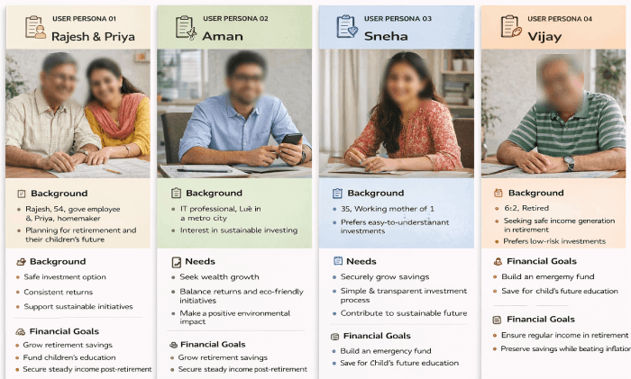
User Personas
The Green FD experience serves users making high-stakes, long-term financial decisions. Personas were defined not by age or income alone, but by risk sensitivity, decision confidence, and accessibility needs.
Conservative Investors
These users carefully evaluate interest rates, tenure, and safety. Ambiguity or complex language increases hesitation and abandonment.
- Clear breakdown of returns and tenure
- Plain-language explanations of terms
- Predictable, step-by-step journey
Senior Citizens
Senior users often experience visual, cognitive, or motor constraints. Accessibility gaps directly affect their ability to complete tasks independently.
- High contrast, readable typography
- Simplified layouts with generous spacing
- Reduced cognitive load and clear focus states
Sustainability-Conscious Investors
These users want to understand how their investment contributes to sustainability, not just that it does.
- Clear explanation of environmental impact
- Separation of sustainability benefits from financial returns
- Evidence-based messaging over marketing language
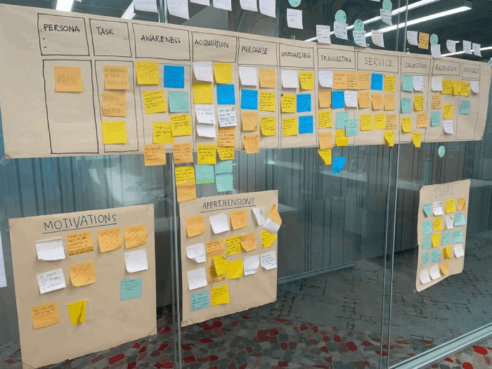
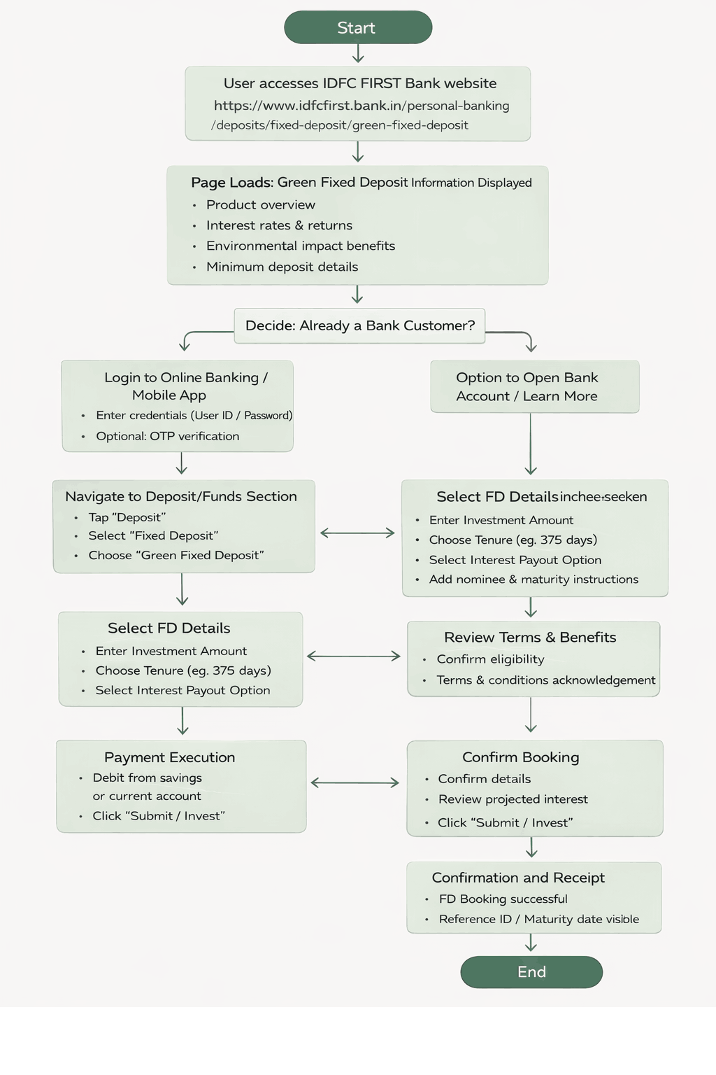
Task flows
Research showed that users understand financial products through their own risk tolerance and life context, not generic descriptions. The Green FD experience was therefore designed to help users recognize themselves in the journey—such as conservative or impact-driven investors—before engaging with detailed information.
Clear decision paths and task flows were shared with engineering to ensure a predictable, accessible, and compliant experience. Based on early feedback, a second iteration refined content depth and clarity, focusing on supporting understanding and reflection, rather than evaluation or comparison.
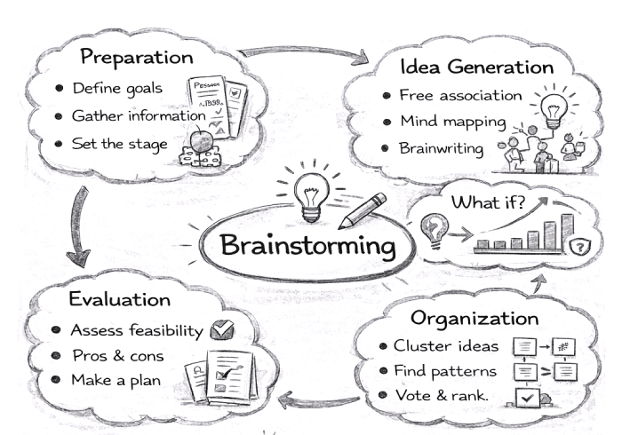
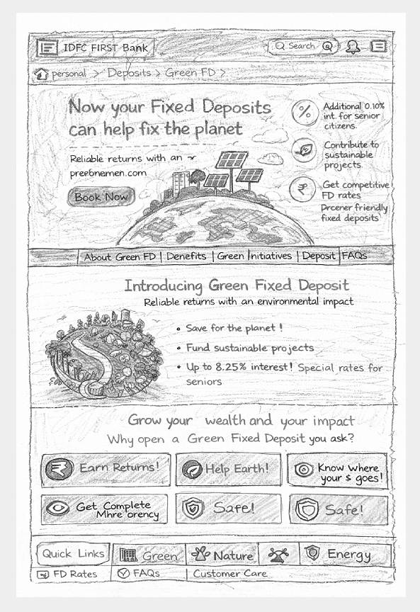
Paper Prototyping
Paper prototyping was used early in the design process to validate content structure, decision flow, and information hierarchy before introducing visual or technical complexity.Low-fidelity sketches helped test how users moved from understanding the product to making a decision—particularly around returns, tenure, and sustainability impact. This approach made it easier to identify cognitive overload, unclear terminology, and unnecessary steps.
Insights from these sessions informed simplification of the journey and were translated into clear task flows for engineering, reducing rework and ensuring the final experience remained calm, predictable, and accessible.
Usability Testing
Usability testing was conducted with 12 participants across key Green FD user segments, including conservative investors, senior users, and sustainability-conscious customers. The objective was to evaluate comprehension, decision clarity, and ease of completion across the core Green FD journey. Participants were asked to complete four critical tasks, including understanding product value, comparing returns, interpreting sustainability impact, and proceeding toward decision or inquiry.
During testing, a small number of users initially relied on the Help and explanatory content to clarify terms and calculations. This did not prevent task completion; once the information was accessed, all participants were able to proceed confidently. Early confusion around returns interpretation and impact explanation highlighted opportunities to improve instructional clarity and content hierarchy. By the end of the sessions, all users confirmed they understood:
- What the product offered.
- How returns and tenure worked.
- How sustainability impact was positioned
- The implications of their decision
Impact
- 22% increase in engagement.
- 18% uplift in conversion
- Improved accessibility compliance
- Reduced task completion time.
Leadership Takeaways
Designing Green FD as a service people can understand and trust ensured adoption without compromising credibility.
- Traditional products benefit from accessibility-led UX.
- Trust improves when complexity is reduced.
- Continuous measurement sustains UX impact.
Refining & Final UI
Final designs were reviewed and validated against defined UX and AI governance guardrails, ensuring consistency across conversational behavior, model outputs, regulatory requirements, and brand tone. The outcome was a digital network assistance platform designed and governed as a long-term intelligent system—rather than a set of isolated conversational flows or responses.
