Design Leadership · Regulated Product · IDFC FIRST Bank

Regulated product as service experience.

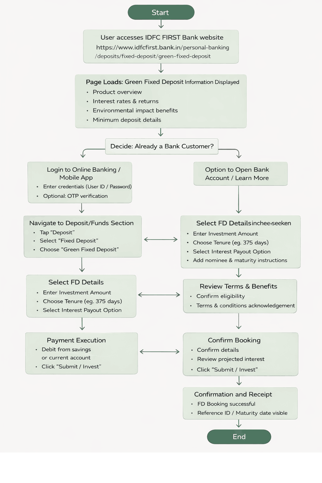
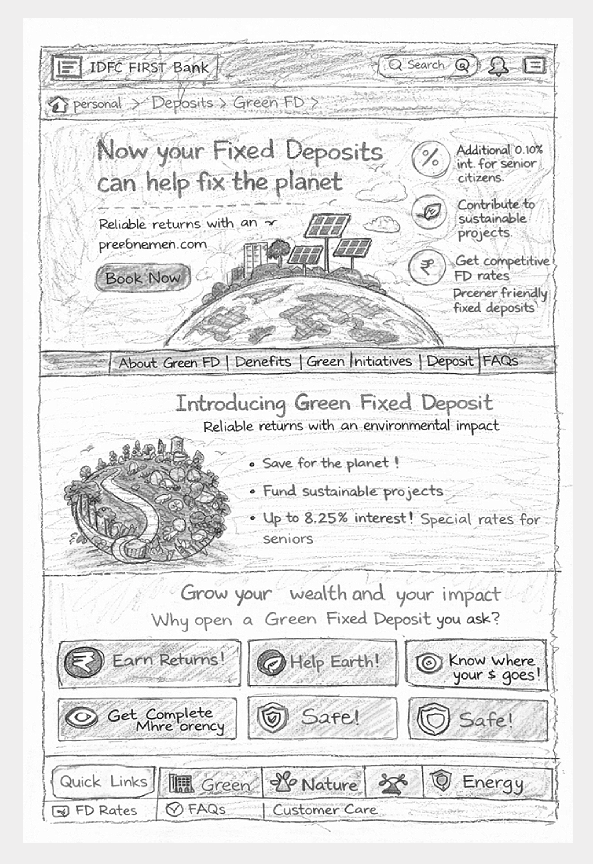
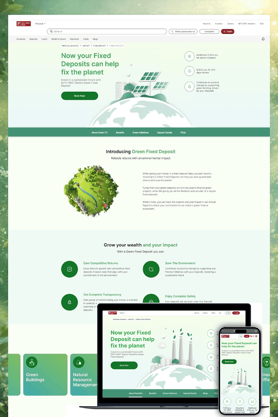
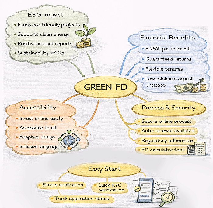
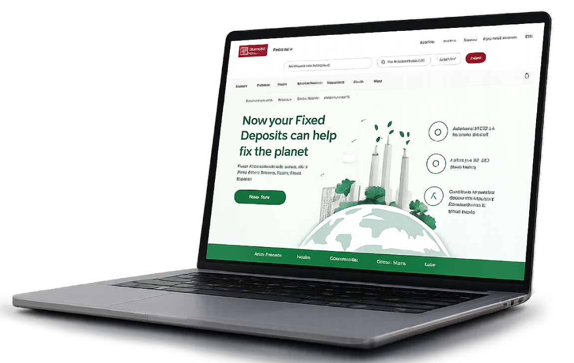
Transforming a regulated, legacy financial product — Green Fixed Deposit — into a modern, accessible, and trust-led digital experience. The objective was not visual modernization alone, but the establishment of a governed product experience system that could scale across channels while meeting regulatory, accessibility, and brand standards.

📈
+22%
Increase in engagement
+18%
Uplift in conversion
WCAG
Accessibility improved
Lower
Task completion time
Personas
Trusted by Leading Brands
IDFC FIRST BankRBI-alignedSustainabilityComplianceAccessibilitySenior users
Scroll
01 — Context

Comprehension before conversion.

01 — Project overview

A trust product.
Designed as a service.

Green FD is a high-trust, long-term product often used by conservative and senior users. The existing experience was disclosure-heavy and optimized for compliance rather than understanding — the mandate was to reverse that.

01 — Context

Regulated, legacy product

Dense financial language and disclosure-heavy layouts increased cognitive load. Sustainability value was abstract and difficult to interpret.
02 — Constraints

Accessibility & compliance non-negotiable

Senior users and conservative investors required accessibility-first design. Regulatory disclosure had to remain intact while comprehension improved.
03 — Opportunity

A service users can trust

Inspired by public-sector UX principles, the redesign approached Green FD as a service with a duty of care — not a marketing surface.
Business objectives

What the organization needed to achieve

  • Redesign the experience as a service users can understand and trust
  • Establish UX governance suitable for regulated products
  • Reduce ambiguity without compromising regulatory disclosure
  • Sign off on a design system that could sustain future iterations
  • Improve engagement and completion without sacrificing credibility
UX & design goals

What the experience needed to do

  • Achieve comprehension before conversion
  • Replace financial jargon with plain language
  • Design for the least confident user first
  • Treat accessibility as a baseline, not an enhancement
  • Use consistency as a trust mechanism
02 — Research & discovery

How people read risk,
not aesthetics.

Research focused on how people interpret financial information and make long-term decisions under uncertainty — emphasizing comprehension, confidence, and accessibility over visual preference.

Discovery research
Discovery research

Methods included review of customer queries and support tickets to identify recurring confusion points, qualitative feedback sessions across conservative and senior user segments, accessibility and readability audits aligned to WCAG, and behavioral analysis of drop-offs and dwell time across the journey.

Findings directly informed content structure, information hierarchy, and interaction decisions — validated through iterative design and measured post-launch with engagement and completion signals.

"I want to understand the return before I think about anything else."

Conservative investor · Comparison-led

"If I can't read the small print, I'll close it. I won't ask my son."

Senior user · Accessibility-sensitive

"Tell me what 'green' actually means here — show me, don't sell me."

Sustainability-led investor · Evidence-driven
User personas

Three risk profiles.

C
Conservative investors
Risk-sensitive · Returns-led
Carefully evaluate interest rates, tenure, and safety. Ambiguity or complex language increases hesitation and abandonment. Need clear breakdowns, plain-language explanations, and a predictable journey.
Plain languagePredictableReturns clarity
S
Senior citizens
Accessibility-led · Trust-led
Often experience visual, cognitive, or motor constraints. Accessibility gaps directly affect their ability to complete tasks independently. High contrast, readable typography, generous spacing, and clear focus states.
High contrastGenerous spacingIndependent
E
Sustainability-conscious investors
Evidence-led · Impact-aware
Want to understand how their investment contributes to sustainability — not just that it does. Need clear separation of impact from returns and evidence-based messaging over marketing language.
Evidence-basedImpact-clearHonest
03 — Core problem

Optimizing for disclosure leaves understanding behind.

01

Dense financial language increased cognitive load and slowed decision-making.

02

Sustainability value was unclear and abstract — present but not understood.

03

Users struggled to interpret returns and tenure in their own context.

04

Accessibility gaps disproportionately affected senior and low-vision users.

04 — My role & execution

Plain language. Public-sector rigour.

I owned the strategic direction, experience vision, and design principles across the program — establishing UX governance, accessibility standards, and decision frameworks aligned to regulatory and business needs.

Guiding principles, aligned with RBI compliance and inspired by government-grade UX systems: clarity before choice; plain language over financial jargon; consistency builds trust; progressive disclosure; and accessibility by default — with readability, contrast, spacing, and focus states as first-class citizens.

Responsibility 01

Define product UX strategy

  • Defined the end-to-end product experience strategy
  • Set principles aligned to regulated, long-term financial products
  • Established the 'service, not surface' design lens
  • Signed-off principles used as the contract for delivery
Responsibility 02

Establish guardrails

  • Established UX guardrails aligned to regulatory and accessibility standards
  • Embedded RBI compliance requirements into design patterns
  • Made WCAG accessibility a baseline, not an enhancement
  • Defined consistency as a trust mechanism
Responsibility 03

Direct research & validation

  • Directed qualitative research across conservative and senior users
  • Validated comprehension and decision clarity in usability testing
  • Refined instructional clarity and content hierarchy iteratively
  • Measured impact through post-launch engagement signals
Responsibility 04

Govern execution & sign-off

  • Governed vendor and internal execution quality
  • Reviewed and approved all key experience decisions before release
  • Held accountability for long-term product quality
  • Established decision frameworks for future iterations
05 — User journey map

Recognize. Understand.
Decide. Trust.

Users were designed to recognize themselves in the journey — conservative or impact-driven investors — before engaging with detailed information. Decision paths were predictable, accessible, and compliant.

Regulated task flow
Regulated task flow

Every screen, template, and confirmation message was anchored to a mapped moment. Every sign-off verified that the moment had been designed for, not assumed. The journey map was the canonical reference through every design and vendor review.

Stage 01
Discover
Relevant roles surface fast regardless of audience. Search, filter, and smart sorting reduce time-to-fit.
Stage 02
Evaluate
Growth signals, eligibility, and role fit visible above the fold. Candidates assess before committing to the apply flow.
Stage 03
Apply
Frictionless flow aligned to context and device. Mobile-first, multi-step with clear progress indication.
Stage 04
Post-application
Post-application visibility and communication shape long-term employer perception. Confirmation is strategy, not a detail.
Principle
"Trust in the brand."
Clarity, relevance, and trust drive candidate decisions — at every stage, on every device. The principle anchored every journey decision.
Drag to explore all stages
06 — Storyboarding, app map & wireframing

From paper prototypes
to a regulated service flow.

Paper prototyping validated content structure, decision flow, and information hierarchy early — identifying cognitive overload, unclear terminology, and unnecessary steps before visual or technical complexity entered.

Paper prototypes
Paper prototypes

Every wireframe was traceable to a journey moment, and every IA decision was signed off before vendor execution. Storyboards were leveraged to align business, brand, talent acquisition, compliance, and vendor teams on what each moment had to feel like — before any pixels were committed.

Eligibility · Approval · Disbursement — a compliant green-finance flow

Homepage Job Listing Role Detail Apply Flow Confirmation Status Track SEARCH & FILTER GROWTH SIGNALS MOBILE-FIRST TRUST-BUILDING VISIBILITY
07 — Design system & UI

Service-grade patterns.
Accessibility-led tokens.

A reusable set of patterns aligned to bank tokens — accessible typography, high-contrast palettes, and content templates that reduced ambiguity while preserving regulatory disclosure.

Design brainstorms
Design brainstorms
Colour · GreenFD · Regulated
Regulated product · trust greens
Type · 2 families
Aa Aa
Display / Body pairing
Spacing · 8pt scale
8 / 16 / 24 / 32 / 48
Components · Modular
Reused across hiring journeys & programs
Aligned to IDFC FIRST brand neutrals
08 — Governance

Accessibility as governance, not a checklist.

08 — UX governance model

Regulated by design.
Auditable by default.

A governance model translated regulatory and accessibility requirements into reusable design patterns and content frameworks — embedding compliance into the experience rather than as a downstream check.

Core UX standards and risk controls were centrally maintained, while implementation remained flexible at the domain level. Governance was lightweight and embedded into delivery workflows, focusing on systemic risks — accessibility, regulatory compliance, brand integrity, apply-flow friction — rather than surface-level design. Continuous improvement was driven through analytics and shared learnings.

Pillar 01

Centralized standards

Core UX standards and risk controls maintained centrally — accessibility, brand expression, regulatory compliance. Reviewed and signed off by UX at executive level. The pen on every standard sat with the UX leader, not the vendor.
Pillar 02

Domain autonomy

Implementation flexible at the domain level — vendors and product teams ship within shared guardrails, not on top of them. Faster, safer iteration. The guardrail defines the boundary; what lives inside it belongs to the delivery team.
Pillar 03

Embedded into delivery

Lightweight governance running inside delivery workflows — focused on systemic risks, not surface design. Continuous improvement via analytics and shared learnings enabling the organization to scale while maintaining trust and consistency.
09 — Usability studies

Tested for confidence.
Not just completion.

Usability testing with 12 participants across conservative, senior, and sustainability-conscious segments evaluated comprehension, decision clarity, and ease of completion across the core Green FD journey.

6
Participants matching persona
5
Critical tasks tested
30+
Qualitative insights generated
4
Themes for refinement
Persona needs → design actions
Candidate needQuickly understand if a role is relevant to their skills and experience.
Design actionPersona-based usability testing to validate role clarity; restructured role pages with growth signals above the fold.
Candidate needFind suitable jobs without excessive scrolling or filter friction.
Design actionAnalyzed navigation paths and search behaviour; refined filters and sorting logic to match real candidate criteria.
Candidate needConfidence before starting an application — know what to expect.
Design actionImproved content hierarchy and CTAs; streamlined apply flow to reduce friction at the highest drop-off point.
Candidate needReassurance that submission was received and is being processed.
Design actionValidated confirmation messaging and post-application communication — redesigning as an employer-brand touchpoint, not a utility screen.
Candidate needFast, predictable apply flow on mobile under real conditions.
Design actionAudited and streamlined the apply flow; validated across primary device types matching the persona's usage context.
01

Clarity of roles

Role pages restructured so candidates established relevance within seconds. Headline, signal-bearing tags, and growth indicators surfaced before scroll.

02

Navigation efficiency

Filters and sorting logic refined to align with the criteria candidates actually used — not the criteria the platform exposed by default.

03

Application confidence

Content hierarchy and CTAs improved so candidates entered the apply flow knowing what to expect. Confirmation messaging validated to reassure on submit.

04

Pre-launch readiness

Insights translated into refinements before launch — reducing rework during vendor implementation and surfacing systemic issues that would have appeared only post-release.

10 — Outcomes

A regulated product
users actually understand.

Final designs were validated against UX and accessibility guardrails — delivering a Green FD experience that improved engagement, conversion, and accessibility while preserving regulatory disclosure.

Final product — demo

A disclosure-heavy product became a service users could trust — design moved from compliance by paragraph to compliance by pattern.

Outcome 01
+22% increase in engagement across the redesigned Green FD experience.
Outcome 02
+18% uplift in conversion driven by clearer comprehension and decision flow.
Outcome 03
Improved accessibility compliance — WCAG-aligned typography, contrast, spacing, and focus states.
Outcome 04
Reduced task completion time through plain language, progressive disclosure, and predictable steps.
Outcome 05

A regulated product governed as a long-term service.

Green FD shifted from a disclosure-heavy product to a service with a duty of care. Plain language, accessibility, and progressive disclosure were embedded into reusable patterns. Compliance lived inside the design system rather than as a downstream review. UX held the pen on the principles that kept the experience clear and accessible as future iterations shipped.

Comprehension-firstPlain languageWCAG accessibilityPublic-sector UXProgressive disclosureRegulated productPattern governanceService mindset
11 — Reflection

What I'd carry forward.

Designing a regulated, long-term financial product is about restoring understanding, not redecorating disclosures. These are the lessons I'd carry into any high-trust banking product.

Executive review
Executive review
The hardest part wasn't the visual redesign.

It was shifting the team from compliance by paragraph to compliance by pattern.
01

Comprehension is the conversion strategy.

When users genuinely understood returns, tenure, and impact, conversion followed without persuasion. The biggest lever was clarity, not creative — comprehension was the funnel.

02

Design for the least confident user first.

Conservative investors and senior users defined the accessibility and language baseline. When the experience worked for them, it worked for everyone — and the inverse was never true.

03

Accessibility belongs in the design system, not a checklist.

Embedding contrast, typography, spacing, and focus states into reusable patterns meant accessibility shipped by default. Patterns out-perform reviews.

04

Treat regulated products as services.

Borrowing principles from public-sector UX — duty of care, plain language, predictable journeys — reframed the work. Green FD was not a marketing surface; it was a service users had to trust over years.

Final deliverable

See the live Green FD experience.

View live site