VP, UX & Product Design · 2024 · Banking · Education Platform
Finance literacy as governed learning.
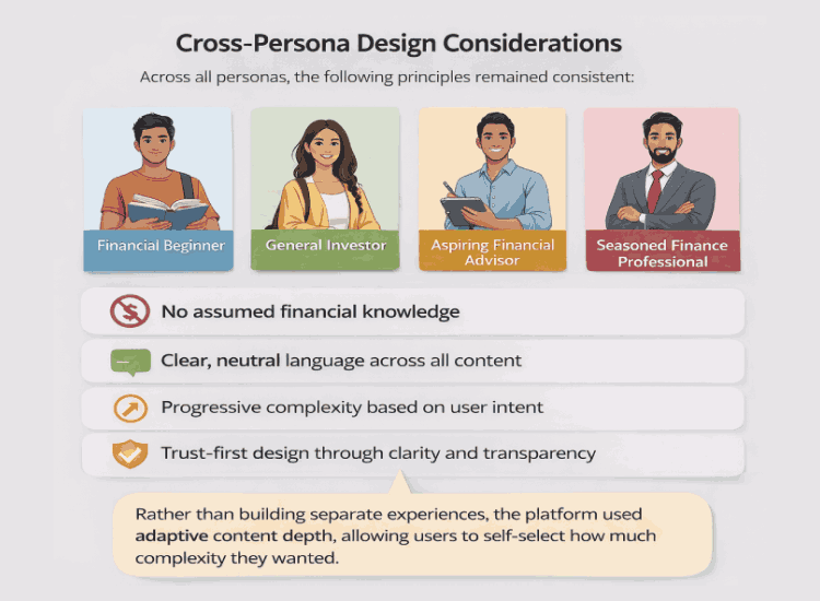
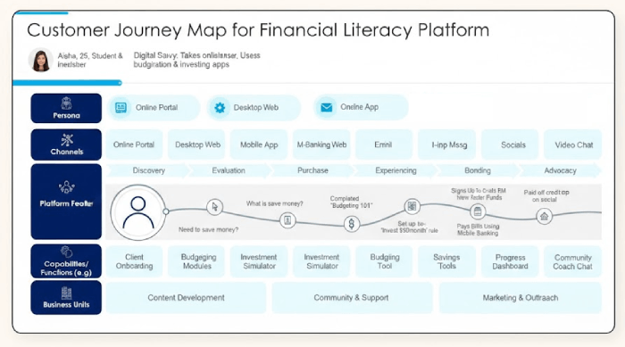
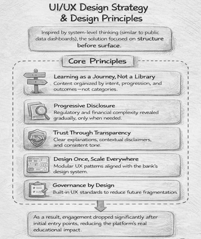
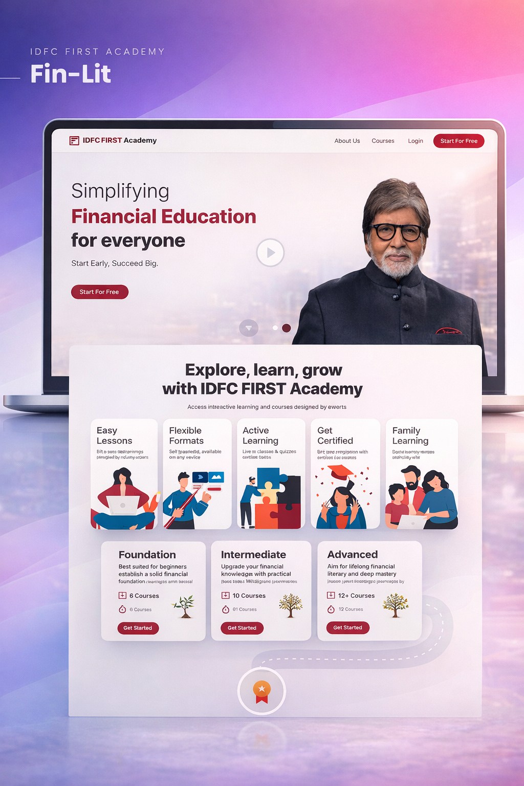
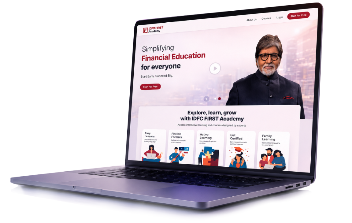
An enterprise-grade financial literacy platform for IDFC FIRST Academy — built to educate diverse audiences at scale under stringent regulatory and compliance constraints. As VP of UX, I defined the experience vision and governance model, ensuring every decision reinforced trust, clarity, and learning effectiveness across products, teams, and vendors.
100%
Compliant by design
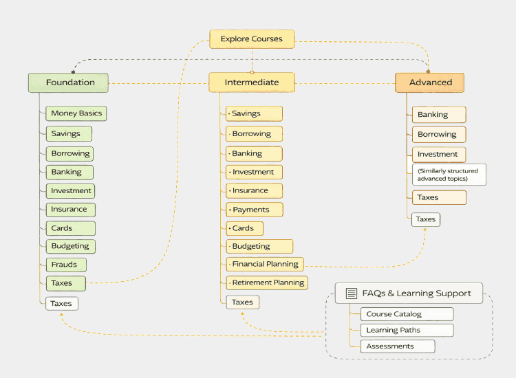
Modular
Reusable learning paths
Cross-team
Compliance · Content · Product
Scalable
From basics to advanced
Trusted by Leading Brands
IDFC FIRST BankIDFC FIRST AcademyRBI-alignedComplianceLegalContent OpsProduct
Scroll