Head of UX · Enterprise · Banking · Governance

Enterprise UX as reliability discipline.

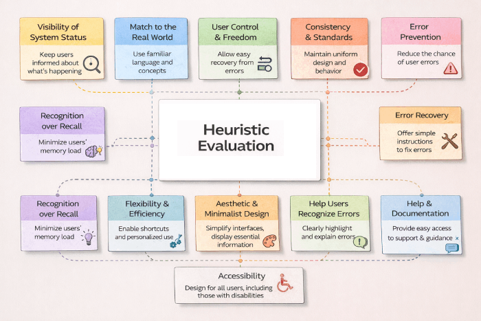
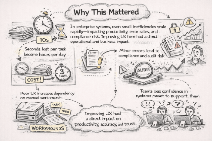
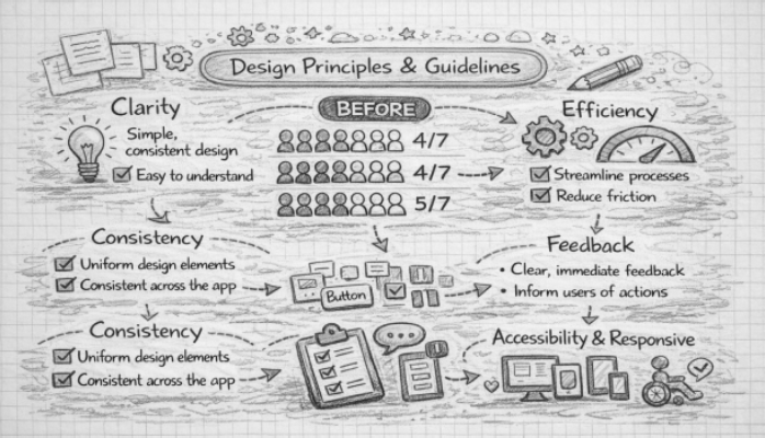
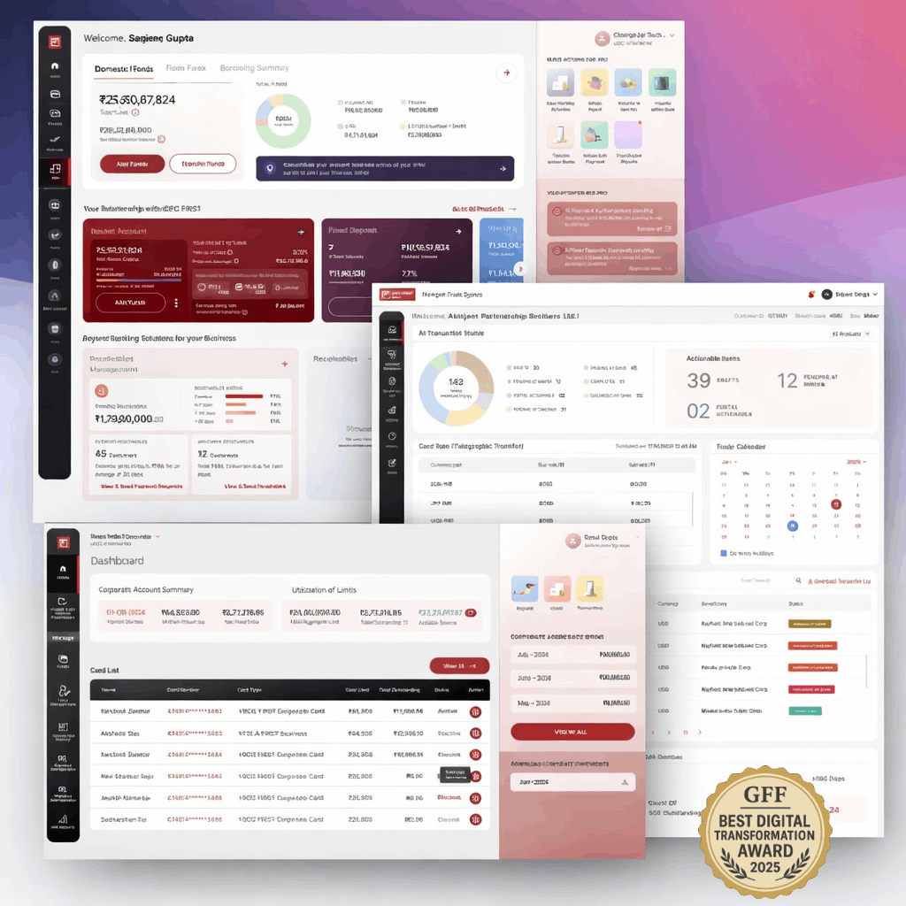
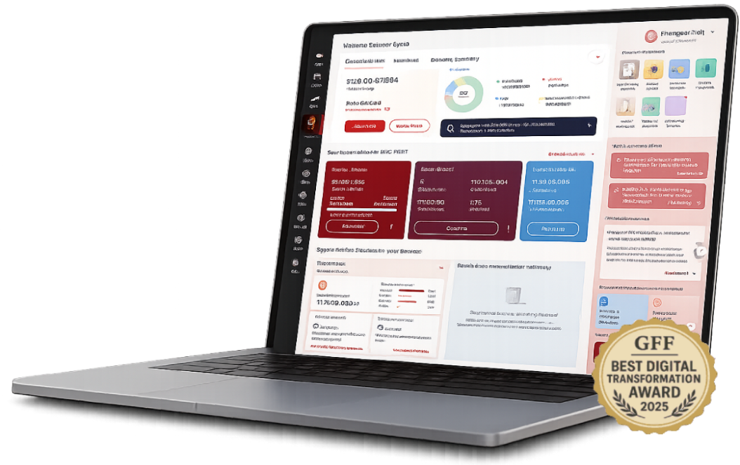
Leadership-level UX transformation of multiple mission-critical enterprise banking applications — focused on workflow clarity, consistency at scale, and UX governance rather than surface-level visual redesign. The mandate was to reduce operational friction, improve reliability, and ensure enterprise UX quality across teams, vendors, and platforms.

Multi-app
Mission-critical scope
🛡
Risk-aware
Audit-grade workflows
🧭
Patterns
Standardized across vendors
🤝
Adoption
Across operational teams
Personas
Trusted by Leading Brands
OperationsRiskComplianceProductEngineeringExternal vendors
Scroll
01 — Context

Small UX inefficiencies compound at enterprise scale.

01 — Project overview

Multiple apps.
One operating standard.

Enterprise systems had evolved organically over years — individually they functioned; collectively they introduced inefficiency, risk, and usability debt. The challenge was not modernization, but rethinking how work actually happens inside the bank.

01 — Context

Fragmented workflows

Workflows were fragmented across applications, with inconsistent UI patterns driven by multiple vendors and no shared standards.
02 — Constraints

Routine, repeatable, high-stakes

Banking operations demand absolute clarity, traceability of actions, and confidence under regulatory review — small UX gaps amplify into operational risk.
03 — Opportunity

Enterprise UX as a system

The opportunity was to move from isolated, screen-by-screen fixes to enterprise-level UX governance with shared patterns and accountability for quality.
Business objectives

What the organization needed to achieve

  • Reduce operational friction across mission-critical applications
  • Improve reliability and reduce compliance and audit risk
  • Standardize interaction patterns across vendor-led implementations
  • Lower dependency on training and tribal knowledge
  • Establish UX as a strategic capability, not a downstream check
UX & design goals

What the experience needed to do

  • Design experiences around real operational tasks, not system features
  • Reduce cognitive load through clear hierarchy and meaningful defaults
  • Enforce shared interaction patterns across applications and vendors
  • Treat validation, error prevention, and recovery as first-class concerns
  • Embed UX standards into delivery processes and approvals
02 — Research & discovery

Users were compensating
for system gaps.

Research and operational reviews revealed that users were relying on memory, experience, and informal workarounds where systems should have provided clear guidance and structure — most visibly during handoffs and edge cases.

Discovery & challenges

Screens were consistently organized around system features rather than real user tasks, increasing cognitive load and slowing execution. Inconsistent patterns across applications forced users to relearn behaviors each time they moved between tools, creating friction and avoidable errors.

The problem was systemic — requiring enterprise-level UX governance and shared standards rather than isolated, screen-by-screen fixes.

"Every system looks different. I rely on memory to do the same task in three places."

Operations user · Customer servicing

"If I miss a step here, it shows up in audit later. I need the system to tell me."

Risk & compliance · Audit-facing

"Overrides are part of my day. I need to know it's safe and reversible before I commit."

Super-user · Exception handling
User personas

Three operational roles.

R
Risk & compliance teams
Audit-facing · Traceability-led
Detail-oriented work that demands clarity, traceability, and confidence the system supports regulatory review. Explicit feedback, clear data provenance, and predictable workflows minimize interpretive risk.
TraceableExplicit feedbackPredictable
O
Operations users
Real-time · Customer-facing
Constant context switching between multiple systems while serving customers. Reduced cognitive load, fast surfacing of relevant information, and consistency across tools enable speed and confidence under pressure.
Low cognitive loadConsistentFast
A
Admins & super-users
Exception-led · High-authority
Manage overrides and configurations that affect downstream operations. Control, visibility, and safe handling of edge cases — actions must remain understandable, reversible, and auditable.
ReversibleAuditableVisible
03 — Core problem

Enterprise UX is a reliability discipline, not a branding exercise.

01

Workflows fragmented across applications, with inconsistent UI patterns from multiple vendors.

02

High cognitive load for routine, repeatable tasks — users compensating with memory and workarounds.

03

Heavy dependency on training and tribal knowledge to bridge gaps the system should have closed.

04

Edge cases and handoffs became failure points — small inefficiencies compounded into operational risk.

04 — My role & execution

Workflows over screens.
Standards over taste.

I owned direction, decision-making, governance, and final sign-off across the enterprise UX transformation — driving a shared vision across products, vendors, and operational teams.

Five non-negotiable principles governed every decision: task over feature, reduce cognitive load, consistency builds trust, design for failure scenarios, and governance by default. These were used as review and sign-off criteria — not aspirations.

Responsibility 01

Workflow mapping

  • Mapped real operational tasks across tools to identify duplication, friction, and risk
  • Distinguished system-feature thinking from task-centric thinking
  • Surfaced handoff and edge-case failure points
  • Built a shared map used across product and vendor teams
Responsibility 02

Pattern definition

  • Created standardized layouts and interaction patterns for tables, forms, filters, and navigation
  • Enforced patterns across vendor-led implementations
  • Reduced relearning across applications
  • Made the right design choice the easiest one
Responsibility 03

Rapid prototyping & validation

  • Tested redesigned workflows with real users under realistic constraints
  • Validated error prevention and recovery paths as first-class concerns
  • Iterated before scaling to additional applications
  • Reduced rework during vendor implementation
Responsibility 04

Systemization & governance

  • Embedded patterns into a shared enterprise design system and delivery checklist
  • Established review checkpoints that focused on systemic risk, not surface design
  • Coached internal product managers on enterprise UX trade-offs
  • Made UX a strategic capability inside the organization
05 — User journey map

Receive. Verify.
Act. Audit.

Operational journeys were mapped task-by-task — surfacing where users were carrying the system rather than the system carrying them. Every pattern decision traced back to a moment on this journey.

What mattered most
What mattered most

Every screen, template, and confirmation message was anchored to a mapped moment. Every sign-off verified that the moment had been designed for, not assumed. The journey map was the canonical reference through every design and vendor review.

Stage 01
Discover
Relevant roles surface fast regardless of audience. Search, filter, and smart sorting reduce time-to-fit.
Stage 02
Evaluate
Growth signals, eligibility, and role fit visible above the fold. Candidates assess before committing to the apply flow.
Stage 03
Apply
Frictionless flow aligned to context and device. Mobile-first, multi-step with clear progress indication.
Stage 04
Post-application
Post-application visibility and communication shape long-term employer perception. Confirmation is strategy, not a detail.
Principle
"Trust in the brand."
Clarity, relevance, and trust drive candidate decisions — at every stage, on every device. The principle anchored every journey decision.
Drag to explore all stages
06 — Storyboarding, app map & wireframing

From audits
to a working pattern library.

Workflow analysis decomposed operational tasks into structural patterns. The pattern library translated those into reusable layouts that vendors could execute against.

Design principles & wireframes

Every wireframe was traceable to a journey moment, and every IA decision was signed off before vendor execution. Storyboards were leveraged to align business, brand, talent acquisition, compliance, and vendor teams on what each moment had to feel like — before any pixels were committed.

Privileged access · Workflow orchestration · Audit trail — pillars of the enterprise UX

Login Dashboard Workspace Selection Action / Edit Flow Approval / Review Reports & Analytics DASHBOARD WORKSPACES ACTION FLOW APPROVAL STATUS TRACKINGS
07 — Design system & UI

Patterns that scale.
Defaults that protect.

A shared enterprise design system encoded layout rules, accessibility requirements, and interaction behavior — making consistency the default and reducing dependency on vendor interpretation.

Privileged design system
Colour · Bank-neutral
Aligned to IDFC FIRST brand neutrals
Type · 2 families
Aa Aa
Display / Body pairing
Spacing · 8pt scale
8 / 16 / 24 / 32 / 48
Components · Modular
Reused across hiring journeys & programs
08 — Governance

Centralized standards. Vendor-proof execution.

08 — UX governance model

Governance embedded
in delivery.

UX standards lived inside delivery checklists and approvals — not on top of them — so quality, consistency, and risk reduction were enforced as the work happened, not after.

Core UX standards and risk controls were centrally maintained, while implementation remained flexible at the domain level. Governance was lightweight and embedded into delivery workflows, focusing on systemic risks — accessibility, regulatory compliance, brand integrity, apply-flow friction — rather than surface-level design. Continuous improvement was driven through analytics and shared learnings.

Pillar 01

Centralized standards

Core UX standards and risk controls maintained centrally — accessibility, brand expression, regulatory compliance. Reviewed and signed off by UX at executive level. The pen on every standard sat with the UX leader, not the vendor.
Pillar 02

Domain autonomy

Implementation flexible at the domain level — vendors and product teams ship within shared guardrails, not on top of them. Faster, safer iteration. The guardrail defines the boundary; what lives inside it belongs to the delivery team.
Pillar 03

Embedded into delivery

Lightweight governance running inside delivery workflows — focused on systemic risks, not surface design. Continuous improvement via analytics and shared learnings enabling the organization to scale while maintaining trust and consistency.
09 — Usability studies

Validation before rollout.
Iteration over launches.

Redesigned workflows were tested with real users under realistic constraints — validating error prevention, recovery paths, and edge-case handling before scaling to additional applications.

6
Participants matching persona
5
Critical tasks tested
30+
Qualitative insights generated
4
Themes for refinement
Persona needs → design actions
Candidate needQuickly understand if a role is relevant to their skills and experience.
Design actionPersona-based usability testing to validate role clarity; restructured role pages with growth signals above the fold.
Candidate needFind suitable jobs without excessive scrolling or filter friction.
Design actionAnalyzed navigation paths and search behaviour; refined filters and sorting logic to match real candidate criteria.
Candidate needConfidence before starting an application — know what to expect.
Design actionImproved content hierarchy and CTAs; streamlined apply flow to reduce friction at the highest drop-off point.
Candidate needReassurance that submission was received and is being processed.
Design actionValidated confirmation messaging and post-application communication — redesigning as an employer-brand touchpoint, not a utility screen.
Candidate needFast, predictable apply flow on mobile under real conditions.
Design actionAudited and streamlined the apply flow; validated across primary device types matching the persona's usage context.
01

Clarity of roles

Role pages restructured so candidates established relevance within seconds. Headline, signal-bearing tags, and growth indicators surfaced before scroll.

02

Navigation efficiency

Filters and sorting logic refined to align with the criteria candidates actually used — not the criteria the platform exposed by default.

03

Application confidence

Content hierarchy and CTAs improved so candidates entered the apply flow knowing what to expect. Confirmation messaging validated to reassure on submit.

04

Pre-launch readiness

Insights translated into refinements before launch — reducing rework during vendor implementation and surfacing systemic issues that would have appeared only post-release.

10 — Outcomes

Fragmented tools became
a cohesive enterprise system.

The program established UX as a strategic capability — shifting enterprise design from isolated fixes to a governed, scalable system with clear accountability for quality and long-term experience health.

Final enterprise app — demo

Disconnected applications became a cohesive enterprise UX system — design moved from screen-level fixes to governed patterns.

Outcome 01
Task completion time reduced through clearer workflows and predictable interaction patterns.
Outcome 02
Operational error rates lowered by designing for validation, edge cases, and failure scenarios.
Outcome 03
Training dependency reduced by embedding guidance, defaults, and consistency into the system.
Outcome 04
UX adoption strengthened across teams and vendors through enforced shared standards and governance.
Outcome 05

Enterprise UX established as a strategic capability.

Beyond usability metrics, the program shifted enterprise design from isolated fixes to a governed, scalable system. Patterns, standards, and review checkpoints created clear accountability for quality and long-term experience health — making UX a defensible part of how the organization ships software, not a decorative final pass.

Workflow-firstPattern libraryVendor governanceAudit-gradeError preventionEdge-case designDefaults & guidanceStrategic UX capability
11 — Reflection

What I'd carry forward.

Great enterprise UX disappears — it enables people to focus on decisions, not interfaces, making systems reliable, predictable, and trusted.

The hardest part wasn't redesigning the screens.

It was establishing UX as a reliability discipline at the enterprise level.
01

Enterprise UX is reliability, not styling.

The work that moved the needle was reducing memory load, enforcing consistency, and designing for failure scenarios — not visual modernization. Treating UX as a reliability discipline reframed every conversation with stakeholders.

02

Task over feature, every time.

Whenever screens were organized around system capabilities instead of operational tasks, cognitive load spiked and errors followed. Designing for how work actually happens — not how systems expose themselves — was the single highest-leverage decision.

03

Patterns prevent vendor drift.

Standardized layouts and interaction behaviors made consistency the default across vendor-led implementations. A shared pattern library turned out to be the most effective form of governance — quieter than reviews, harder to bypass.

04

Governance by default beats reviews after the fact.

Embedding standards into delivery processes and approvals meant quality was enforced as work happened. Reviews catch problems; defaults prevent them — and that distinction defined the program's long-term durability.

Final deliverable

See the source case study.

View source case study