Sr. Product Designer · Telecom · Enterprise Platform

UUI-Time-to-task, not time-to-train.

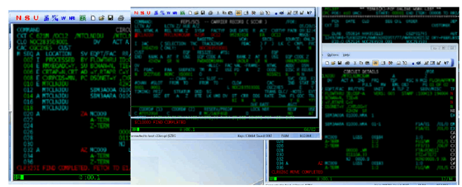
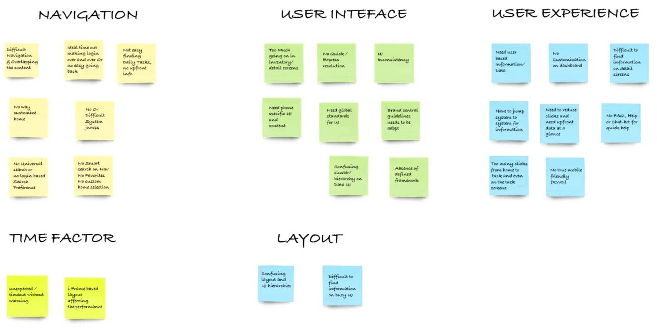
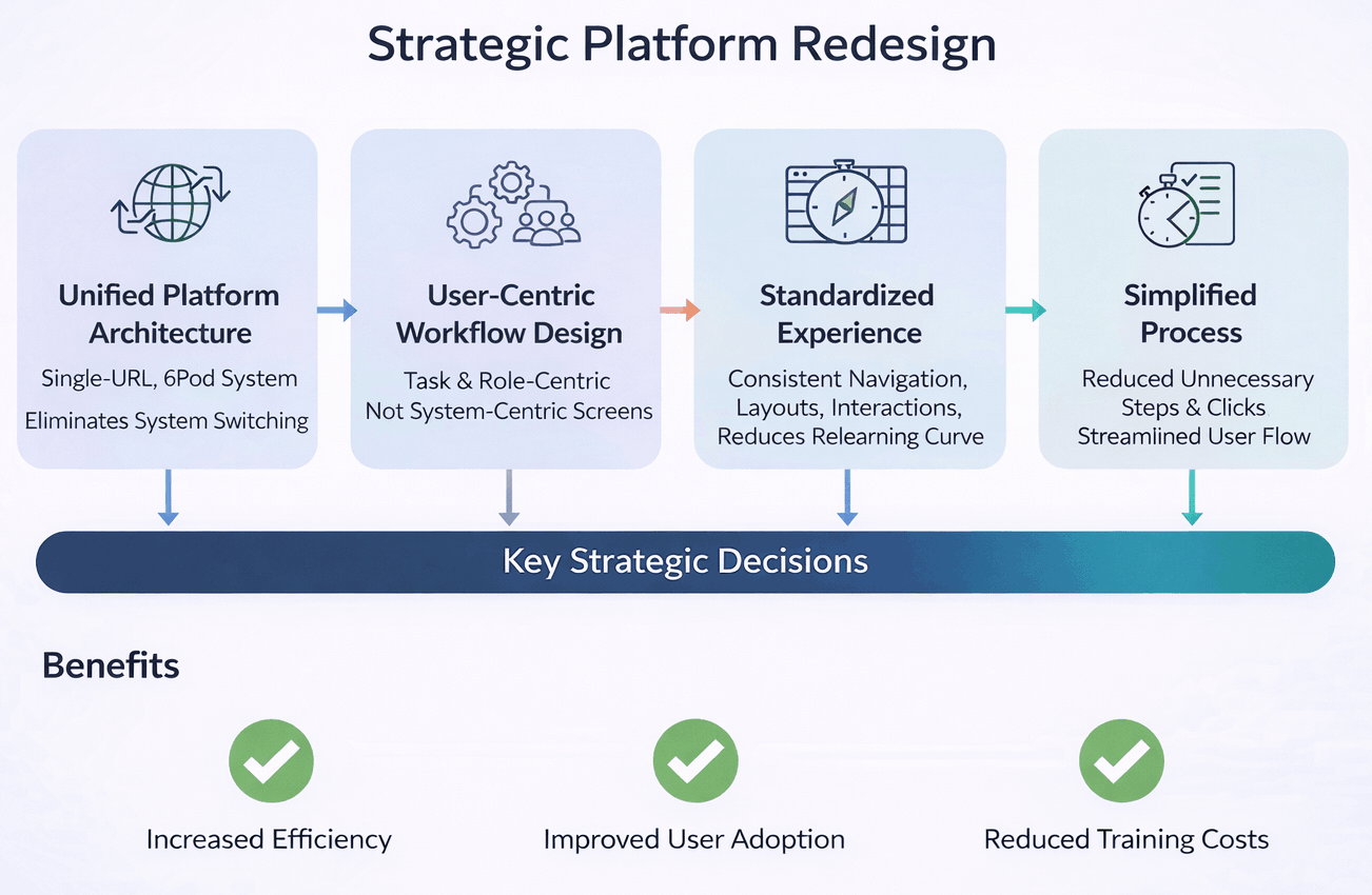
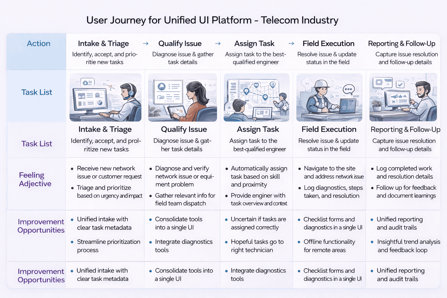
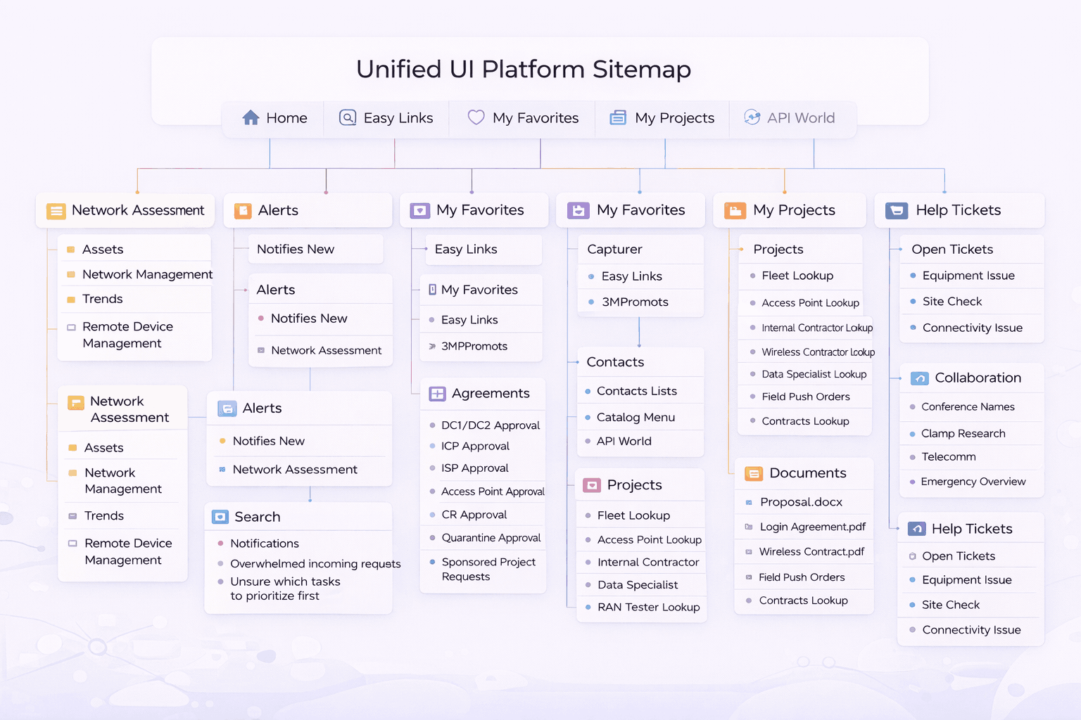
Brainchild a large-scale enterprise UX transformation for a telecom organization with more than 50 years of legacy systems. UUI upgraded a fragmented ecosystem into a single intelligent platform that prioritizes time-to-task over time-to-train — bringing systems to the user instead of asking the user to navigate between them.


-35%
Task completion time
🎓
-40%
Training effort
🧩
Unified
Platform adoption
🤝
Trusted
System confidence
Personas
Trusted by Leading Brands
Telecom enterpriseOperationsNOCEngineeringField techService assurance
Scroll
01 — Context

Bring systems to the user — not the user to systems.

01 — Project overview

Hundreds of tools.
One operating model.

Internal tools had been built in silos over decades — each optimized for a specific function, system, or vendor. The result was a fragmented experience that traded time and productivity for task completion.

01 — Context

Decades of silos

Hundreds of siloed applications with inconsistent navigation, layouts, and patterns — users jumped from system to system to gather information or complete a single task.
02 — Constraints

Real-world legacy

Workflows optimized around system constraints rather than real user responsibilities — heavy reliance on training, documentation, and tribal knowledge.
03 — Opportunity

Unified, intelligent platform

The opportunity was a single-URL, SPA-based platform that adapted to roles and responsibilities — eliminating system switching as a daily tax.
Business objectives

What the organization needed to achieve

  • Reduce time and productivity lost to system fragmentation
  • Modernize legacy ecosystem without breaking continuity of operations
  • Reduce training dependency across the enterprise
  • Enable long-term digital scalability
  • Establish a unified experience model across business units
UX & design goals

What the experience needed to do

  • Prioritize time-to-task over time-to-train
  • Standardize navigation, layouts, and interaction behaviors
  • Reduce unnecessary steps, clicks, and repeated inputs
  • Design reusable patterns scalable across teams and applications
  • Adapt to how people work, not force people to adapt to systems
Legacy mainframe terminal systems — what operators used before UUI
Legacy mainframe terminal systems — the 50-year-old tools UUI replaced
02 — Research & discovery

Users navigated systems
instead of completing tasks.

Research was hands-on, continuous, and embedded directly into design work — contextual inquiries, task walkthroughs, observation of live workflows, and rapid validation through low-fidelity prototypes.

Research brainstorming — categorized insights across Navigation, User Interface, User Experience, Time Factor, and Layout
Structured brainstorming — categorized pain points across navigation, UI, UX, performance, and layout
User personas — Jake Lewis (Field Technician) and Sarah Mitchell (Network Operations Manager)
Role-based personas: Field Technician and Network Operations Manager

A key insight emerged repeatedly: users spent more effort navigating systems than completing tasks. Workflows were optimized around system constraints rather than operational reality — and the solution had to invert that relationship.

Personas were defined by roles, responsibility, and task frequency — not demographics. Journey mapping uncovered systemic friction across multi-step workflows, emotional drop-offs during repetitive tasks, and high-impact opportunities to reduce effort.

"I log into four systems before I've answered the customer's first question."

Operations user · Customer-facing

"Training a new joiner takes weeks. Half of it is just where things live."

Team lead · Onboarding

"If the dashboard surfaced what I need at shift start, I'd save an hour a day."

NOC operator · Shift-based
User personas

Roles, not demographics.

O
Operations users
High-frequency · Multi-system
Real-time customer servicing across multiple tools. Need fast surfacing of relevant information and consistency across systems.
Multi-systemReal-timeConsistent
N
NOC operators
Shift-based · Monitoring-led
Manage incidents and escalations under time pressure. Need a unified view with widget priority tuned to operational responsibilities.
Unified viewPriority-ledIncident-aware
E
Network engineers
Planning · Analytical
Design and validate infrastructure across long sessions. Need depth, accuracy, and the ability to context-switch without losing state.
StatefulAnalyticalLong sessions
03 — Core problem

The biggest UX gap wasn't visual — it was missing unified thinking.

01

Hundreds of siloed applications with inconsistent navigation, layouts, and interaction patterns.

02

Users jumping system to system to gather information or complete a single task.

03

Workflows optimized around system constraints rather than real user responsibilities.

04

Heavy reliance on training, documentation, and tribal knowledge — no shared design language.

04 — My role & execution

Apps as widgets.
Dashboard as the platform.

I was the primary conceptual owner and hands-on designer — designing the core interaction model, dashboard architecture, workflows, and system patterns that defined how UUI operates in practice.

Strategic Platform Redesign — Unified Architecture → User-Centric Workflow → Standardized Experience → Simplified Process
Strategic Platform Redesign — from unified architecture to simplified process

Key platform concepts: applications as data widgets within a unified dashboard; an AI/ML-driven dashboard that populates dynamically by role and behavior; a multi-profile experience letting users switch context without switching systems; context switching without system switching; and an internal app store for adding or removing widgets as responsibilities evolve — under enterprise governance.

Responsibility 01

Conceive the platform

  • Conceptualized the UUI platform vision and experience model
  • Defined the time-to-task over time-to-train principle
  • Established the widget-and-dashboard interaction model
  • Designed for adaptive, role-aware experiences
Responsibility 02

Design hands-on

  • Designed interaction flows, dashboards, and widget-based UI patterns
  • Led brainstorming, whiteboarding, and problem-solving sessions
  • Iterated continuously based on real-world usage
  • Partnered closely with engineering on feasibility and integration
Responsibility 03

Build the design system

  • Built and evolved the design system and component framework
  • Applied Atomic Design as the structural model
  • Encoded standards into reusable components
  • Enabled teams to ship without breaking consistency
Responsibility 04

Govern at platform level

  • Embedded governance into the platform and design system
  • Defined consistent review and sign-off checkpoints
  • Created shared UX toolkits for designers and developers
  • Made the right design choice the easiest one
Design Execution — UI/UX Design, Development, and Performance Optimization
Design execution model — UI/UX Design → Development → Performance & Optimization
05 — User journey map

Arrive. Recognize.
Act. Move on.

Personas were grounded in roles and task frequency. Journeys highlighted systemic friction across multi-step workflows — directly informing dashboard logic, widget composition, and interaction patterns.

Unified journey map
Unified journey map

Every screen, template, and confirmation message was anchored to a mapped moment. Every sign-off verified that the moment had been designed for, not assumed. The journey map was the canonical reference through every design and vendor review.

Stage 01
Discover
Relevant roles surface fast regardless of audience. Search, filter, and smart sorting reduce time-to-fit.
Stage 02
Evaluate
Growth signals, eligibility, and role fit visible above the fold. Candidates assess before committing to the apply flow.
Stage 03
Apply
Frictionless flow aligned to context and device. Mobile-first, multi-step with clear progress indication.
Stage 04
Post-application
Post-application visibility and communication shape long-term employer perception. Confirmation is strategy, not a detail.
Principle
"Trust in the brand."
Clarity, relevance, and trust drive candidate decisions — at every stage, on every device. The principle anchored every journey decision.
Drag to explore all stages
06 — Storyboarding, app map & wireframing

From whiteboards
to a widget architecture.

Whiteboarding translated research insights into testable experience flows — visualizing end-to-end interactions across multiple systems within a single unified context, before high-fidelity execution.

Unified UI Platform Sitemap — information architecture
Unified UI Platform Sitemap — complete information architecture

Every wireframe was traceable to a journey moment, and every IA decision was signed off before vendor execution. Storyboards were leveraged to align business, brand, talent acquisition, compliance, and vendor teams on what each moment had to feel like — before any pixels were committed.

Topology · Element view · Alarm console — the unified network operator surface

Login Dashboard Workspace Personalization Analytics Governance PERSONALIZATION TASK DELIVERY OPTIMIZATION CONTROL REUSABILITY
07 — Design system & UI

Atomic by design.
Governed by component.

The UUI design system was built using Atomic Design principles — decomposing complex enterprise workflows into reusable, governed building blocks that could evolve independently while remaining coherent.

Atomic Design System — colors, typography, inputs, grid, icons, components, templates
Atomic Design System — full component library
Design System Information Architecture — Component and Visual specification tree
Design System IA — Component & Visual specification hierarchy
Colour · Unified UI · Telecom
Telecom UI · cool blue tokens
Aligned to IDFC FIRST brand neutrals
Type · 2 families
Aa Aa
Display / Body pairing
Spacing · 8pt scale
8 / 16 / 24 / 32 / 48
Components · Modular
Reused across hiring journeys & programs
08 — Governance

Governance as system capability, not manual process.

08 — UX governance model

Standards baked
into components.

Governance was designed as a system capability — design standards encoded into components, consistent review checkpoints, and shared UX toolkits across disciplines.

UX Governance Model — UX → Front-end UI → Development → Go Live with audit checkpoints
UX Governance Model — end-to-end process from analysis through development to go-live

Core UX standards and risk controls were centrally maintained, while implementation remained flexible at the domain level. Governance was lightweight and embedded into delivery workflows, focusing on systemic risks — accessibility, regulatory compliance, brand integrity, apply-flow friction — rather than surface-level design. Continuous improvement was driven through analytics and shared learnings.

Pillar 01

Centralized standards

Core UX standards and risk controls maintained centrally — accessibility, brand expression, regulatory compliance. Reviewed and signed off by UX at executive level. The pen on every standard sat with the UX leader, not the vendor.
Pillar 02

Domain autonomy

Implementation flexible at the domain level — vendors and product teams ship within shared guardrails, not on top of them. Faster, safer iteration. The guardrail defines the boundary; what lives inside it belongs to the delivery team.
Pillar 03

Embedded into delivery

Lightweight governance running inside delivery workflows — focused on systemic risks, not surface design. Continuous improvement via analytics and shared learnings enabling the organization to scale while maintaining trust and consistency.
09 — Usability studies

Accessibility & performance
at platform level.

Accessibility was embedded at the system level — WCAG-compliant contrast and typography, keyboard navigation, screen-reader support, and clear focus states across all components. Performance shaped the interaction model itself.

6
Participants matching persona
5
Critical tasks tested
30+
Qualitative insights generated
4
Themes for refinement
Persona needs → design actions
Candidate needQuickly understand if a role is relevant to their skills and experience.
Design actionPersona-based usability testing to validate role clarity; restructured role pages with growth signals above the fold.
Candidate needFind suitable jobs without excessive scrolling or filter friction.
Design actionAnalyzed navigation paths and search behaviour; refined filters and sorting logic to match real candidate criteria.
Candidate needConfidence before starting an application — know what to expect.
Design actionImproved content hierarchy and CTAs; streamlined apply flow to reduce friction at the highest drop-off point.
Candidate needReassurance that submission was received and is being processed.
Design actionValidated confirmation messaging and post-application communication — redesigning as an employer-brand touchpoint, not a utility screen.
Candidate needFast, predictable apply flow on mobile under real conditions.
Design actionAudited and streamlined the apply flow; validated across primary device types matching the persona's usage context.
01

Clarity of roles

Role pages restructured so candidates established relevance within seconds. Headline, signal-bearing tags, and growth indicators surfaced before scroll.

02

Navigation efficiency

Filters and sorting logic refined to align with the criteria candidates actually used — not the criteria the platform exposed by default.

03

Application confidence

Content hierarchy and CTAs improved so candidates entered the apply flow knowing what to expect. Confirmation messaging validated to reassure on submit.

04

Pre-launch readiness

Insights translated into refinements before launch — reducing rework during vendor implementation and surfacing systemic issues that would have appeared only post-release.

10 — Outcomes

A fragmented ecosystem became
a unified platform.

Final designs were validated against UX guardrails — reducing task completion time by 35% and training effort by 40%, while driving unified adoption and stronger system trust across business units.

Unified UI in production

A 50-year-old legacy ecosystem became a single intelligent platform — design moved from system-centric screens to role-aware workflows.

Final deliverable

See the Final Demo

Final Demody
Outcome 01
35% reduction in task completion time through unified dashboard and widget-based workflows.
Outcome 02
40% reduction in training effort by replacing tribal knowledge with role-aware defaults.
Outcome 03
Unified platform adoption across business units — single-URL, SPA-based experience.
Outcome 04
Improved productivity, confidence, and trust in systems through consistency and predictability.
Outcome 05

A platform that adapts to how people work.

UUI inverted the legacy model — instead of users navigating systems to complete tasks, the platform brought systems to the user. Multi-profile dashboards, widget-based workflows, and an internal app store made the experience role-aware and adaptive, while Atomic Design and platform-level governance kept consistency intact as teams shipped independently.

Time-to-taskWidget architectureAtomic DesignRole-awareMulti-profilePlatform governanceLegacy modernizationAccessibility by default
11 — Reflection

What I'd carry forward.

Transforming a 50-year-old enterprise ecosystem is a thinking problem as much as a design one. These are the lessons I'd carry into any large legacy modernization.

The hardest part wasn't the UI.

It was inverting the model from users navigating systems to systems serving the user.
01

Enterprise UX succeeds when designers stay hands-on with systems, not just screens.

Spending time inside live workflows — observing how people actually use legacy tools — surfaced friction that interviews alone never would. Hands-on research was the foundation.

02

Unified platforms save time by reducing navigation, not adding abstraction.

UUI's value came from removing the daily tax of system switching. Adding cleaner abstractions on top of fragmented systems would have failed; replacing the navigation model itself worked.

03

AI-driven personalization is most effective when grounded in real workflows.

Role-aware dashboards and adaptive widgets only delivered value because they were built from observed workflows, not hypothetical use cases. Personalization without ground truth is noise.

04

Design systems accelerate velocity only when aligned to how people work.

Atomic Design at the component level paired with workflow-level decisions kept the system both consistent and useful. A design system that ignores task structure is a style guide.