UX Management · World Bank · Offshore–Onsite UXM

UXM as operating capability.

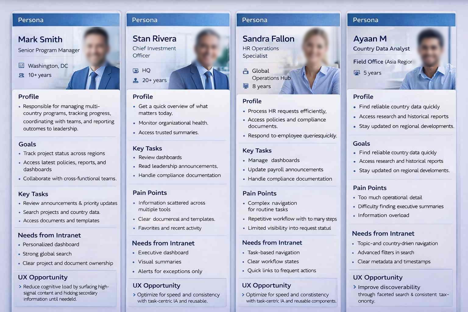
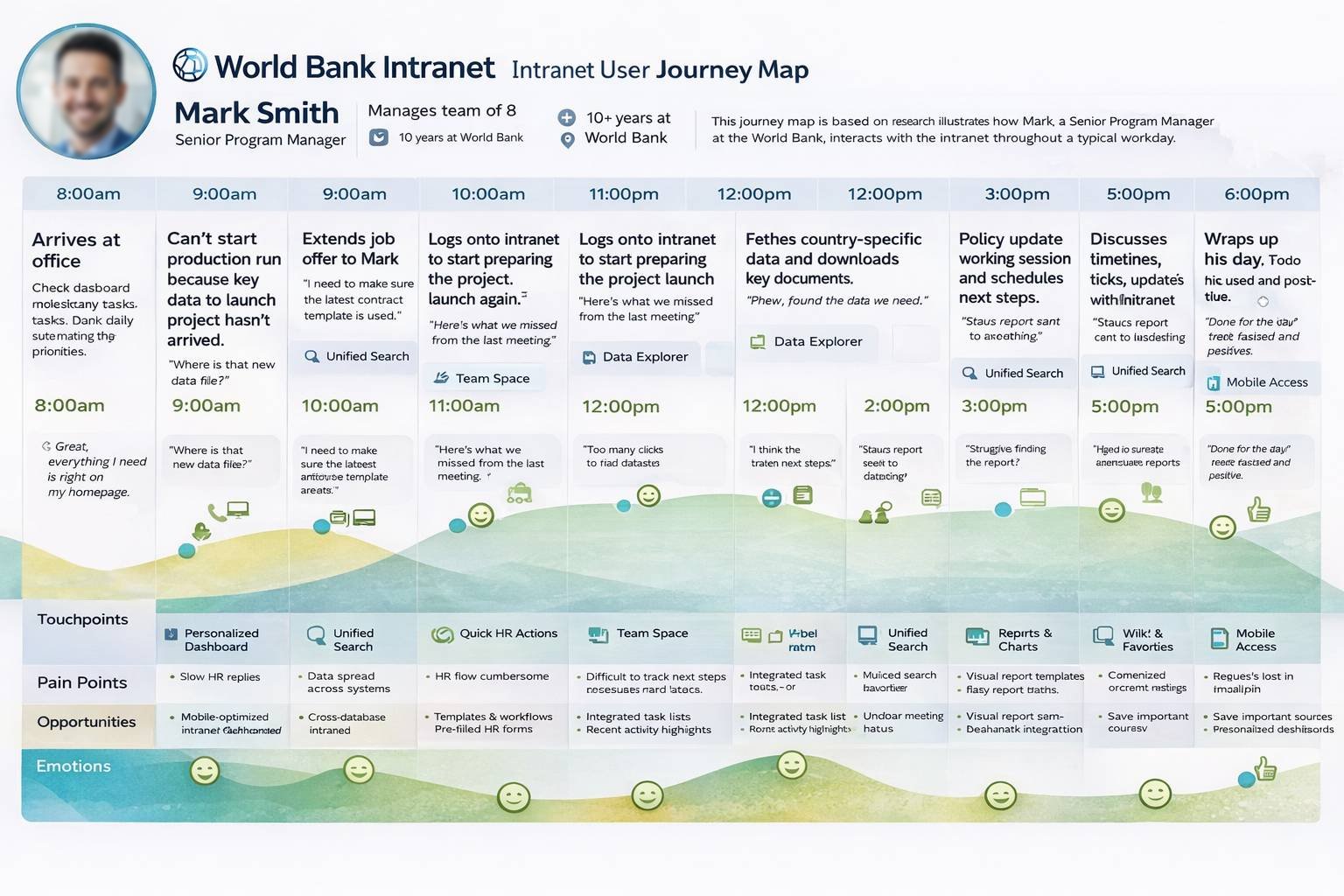
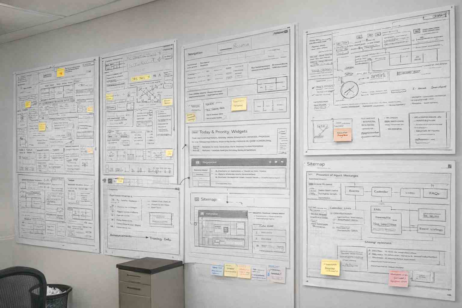
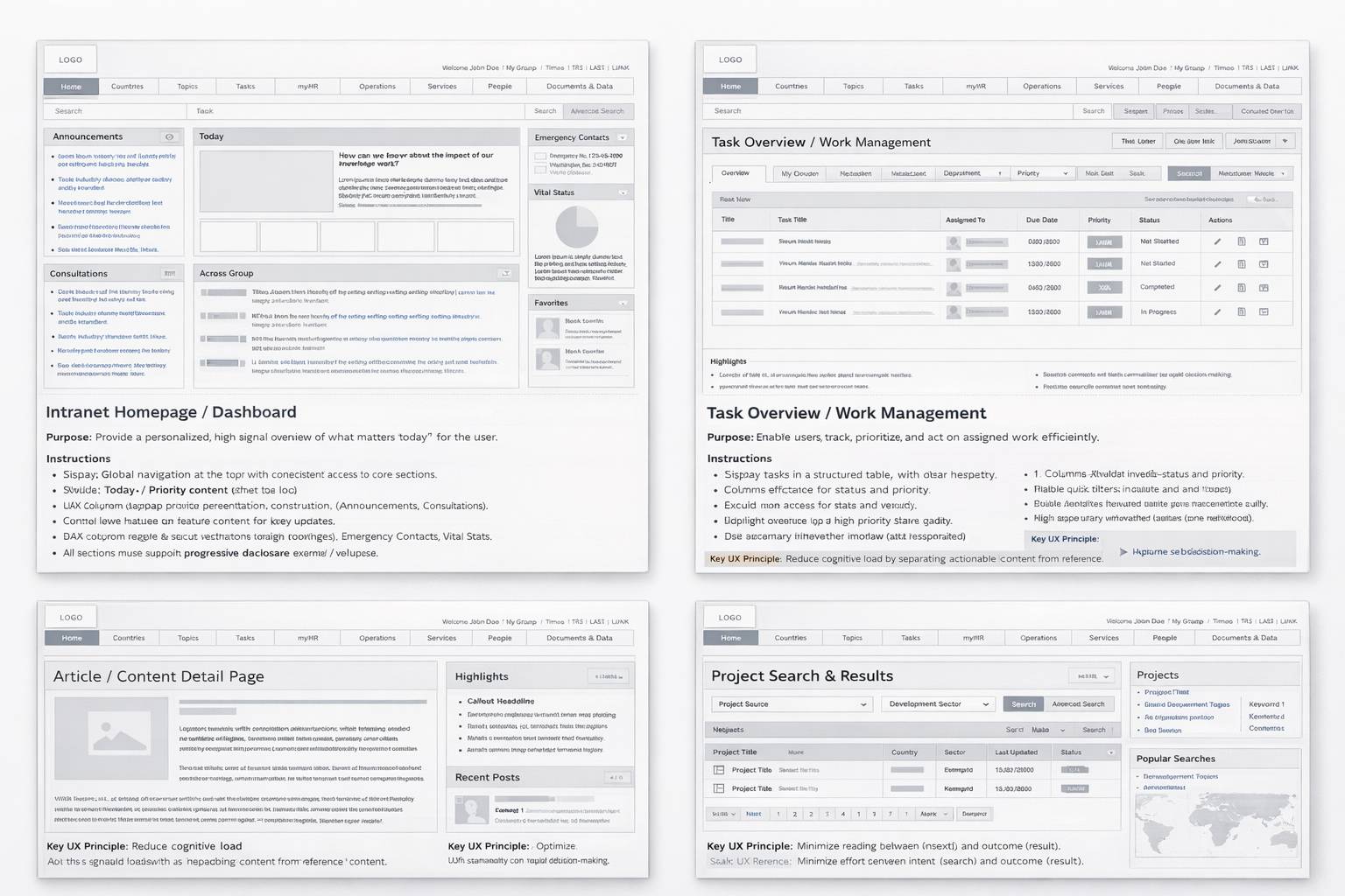
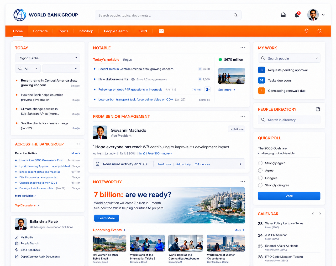
World Bank Group's Information Solutions Group (ISGIS) engaged an external UXM team to establish a structured UX capability through an offshore–onsite delivery model — supporting interaction design, wireframes, visual design, and production-ready HTML across numerous intranet websites and applications for employees at headquarters and country offices.

🌐
Global
HQ + country offices
Performant
Low-bandwidth ready
🧩
Reusable
UX artifacts
🤝
Offshore–onsite
Delivery model
Personas
Trusted by Leading Brands
World Bank GroupISGISLiferaySharePointCountry officesHQ
Scroll
01 — Context

UXM must scale without losing institutional consistency.

01 — Project overview

Structured UX capability
at institutional scale.

Managing UX across numerous intranet websites and applications had become fragmented. UX work was largely reactive — constant enhancements and urgent fixes — leaving little room for strategic experience planning or long-term standardization.

01 — Context

Reactive UX at scale

Inconsistent interfaces, higher cognitive load for users, and inefficiencies across design and development teams — the consequence of no unified UX guidelines or reusable interaction patterns.
02 — Constraints

Cost & delivery discipline

Specialized UX capabilities had to scale efficiently while maintaining cost and delivery discipline — including fast performance even in low-bandwidth country offices.
03 — Opportunity

Offshore–onsite UXM model

The opportunity was a structured UXM capability with reusable artifacts, design standards, and production-ready front-end delivery that could scale across the institution.
Business objectives

What the organization needed to achieve

  • Reduce user memory load across intranet applications
  • Ensure consistent and meaningful screen elements
  • Align new features with familiar user patterns
  • Deliver long-term, scalable UX solutions
  • Enable fast loading even in low-bandwidth country offices
UX & design goals

What the experience needed to do

  • Improve usability and findability across the intranet
  • Increase intranet adoption with predictable patterns
  • Add interactive widgets using modern technologies
  • Improve performance using sprites and optimized code
  • Establish reusable UX artifacts and front-end practices
02 — Research & discovery

Not information.
Information architecture.

User interviews with employees across headquarters and country offices — paired with empathy mapping — revealed that users were not struggling for lack of information, but with how information was structured, presented, and accessed.

Personas
Personas

The intranet contained a large volume of content, tools, and links — but users often found it difficult to identify what actions to take or where to begin. Information was abundant but poorly prioritized. Inconsistent placement and behavior of UI elements increased cognitive load and slowed task completion.

The experience felt fragmented and effortful when users expected a single, predictable system that enabled confident action.

"There's so much here. I just don't know where to start most days."

HQ employee · Daily user

"I'm in a country office on slow internet. I need pages to load — not animate."

Country office user · Low-bandwidth

"Every section behaves differently. I gave up using half the intranet."

Long-tenure employee · Multi-portal
User personas

HQ to country offices.

HQ
Headquarters employee
Multi-portal · Information-dense
Works across many internal portals daily. Needs clear prioritization, predictable navigation, and reusable UI behaviors across applications.
Multi-portalPredictableFindability
CO
Country office user
Low-bandwidth · Mobile-aware
Operates on slower networks with constrained device and bandwidth. Needs lightweight UI, optimized loading, and resilient interactions.
LightweightOptimizedResilient
AD
Application admin
Operational · Governance-led
Manages content and configuration across portals. Needs reusable patterns, governance hooks, and consistent component behavior.
ReusableGovernedConsistent
03 — Core problem

Inconsistency made an information-rich intranet feel empty.

01

Fragmented UX across numerous intranet websites and applications.

02

Reactive work driven by enhancements and fixes — no room for standardization.

03

Inconsistent UI patterns, higher cognitive load, and design/dev inefficiencies.

04

Need for specialized UX capability at optimized cost and faster turnaround.

04 — My role & execution

UXM as
operating capability.

I worked within an offshore–onsite UXM model — contributing to the definition and execution of experience standards that translated usability principles into scalable, production-ready solutions.

The work spanned UX management, interaction design, IA, visual design, and production-ready front-end delivery — defining and applying UX standards, reviewing wireframes and HTML prototypes, ensuring consistency across enterprise web properties, and driving reuse through standardized UI components and design patterns.

Responsibility 01

Define UX standards

  • Defined and applied UX standards across intranet applications
  • Translated usability principles into scalable patterns
  • Established interaction guidelines reusable across portals
  • Made consistency the default across teams
Responsibility 02

Lead IA & interaction design

  • Supported information architecture across portals
  • Rationalized complex site maps into navigable structures
  • Designed interaction patterns for findability
  • Reduced layers without losing access to critical content
Responsibility 03

Deliver production-ready front-end

  • Created and reviewed low-fi wireframes and hi-fi HTML prototypes
  • Delivered standards-compliant HTML, modular CSS, and JavaScript
  • Customized themes for Liferay and SharePoint
  • Used sprites and optimization for low-bandwidth contexts
Responsibility 04

Drive reuse & governance

  • Drove reuse through standardized UI components and design patterns
  • Collaborated through structured work requests and design reviews
  • Established review checkpoints for production-readiness
  • Built the UXM operating model alongside delivery
05 — User journey map

Land. Recognize.
Find. Act.

User journeys across HQ and country offices were mapped — surfacing where information architecture, consistent patterns, and performance optimization removed daily friction.

User journey
User journey

Every screen, template, and confirmation message was anchored to a mapped moment. Every sign-off verified that the moment had been designed for, not assumed. The journey map was the canonical reference through every design and vendor review.

Stage 01
Discover
Relevant roles surface fast regardless of audience. Search, filter, and smart sorting reduce time-to-fit.
Stage 02
Evaluate
Growth signals, eligibility, and role fit visible above the fold. Candidates assess before committing to the apply flow.
Stage 03
Apply
Frictionless flow aligned to context and device. Mobile-first, multi-step with clear progress indication.
Stage 04
Post-application
Post-application visibility and communication shape long-term employer perception. Confirmation is strategy, not a detail.
Principle
"Trust in the brand."
Clarity, relevance, and trust drive candidate decisions — at every stage, on every device. The principle anchored every journey decision.
Drag to explore all stages
User journey
User journey
06 — Storyboarding, app map & wireframing

From site maps
to a unified intranet.

The initial site map was highly complex with overlapping sections. The objective was to rationalize structure — reducing layers while keeping all critical information accessible — and prioritize clarity, findability, and task efficiency.

Wireframes & IA
Wireframes & IA

Every wireframe was traceable to a journey moment, and every IA decision was signed off before vendor execution. Storyboards were leveraged to align business, brand, talent acquisition, compliance, and vendor teams on what each moment had to feel like — before any pixels were committed.

News · Knowledge · People — the global intranet triad

Homepage Job Listing Role Detail Apply Flow Confirmation Status Track SEARCH & FILTER GROWTH SIGNALS MOBILE-FIRST TRUST-BUILDING VISIBILITY
07 — Design system & UI

Reusable UI components.
Production-ready patterns.

Standardized HTML components, modular CSS and JavaScript, and Liferay/SharePoint theming — encoded into a UXM operating model that scaled across portals and country contexts.

Colour · World Bank Intranet
World Bank · institutional blue
Type · 2 families
Aa Aa
Display / Body pairing
Spacing · 8pt scale
8 / 16 / 24 / 32 / 48
Components · Modular
Reused across hiring journeys & programs
Intranet UI
Intranet UI
08 — Governance

Govern through reusable artifacts, not approvals.

08 — UX governance model

UXM as
governance in flow.

The UXM operating model embedded standards into reusable artifacts, structured work requests, and design reviews — making governance fast and consistent across a distributed delivery model.

Core UX standards and risk controls were centrally maintained, while implementation remained flexible at the domain level. Governance was lightweight and embedded into delivery workflows, focusing on systemic risks — accessibility, regulatory compliance, brand integrity, apply-flow friction — rather than surface-level design. Continuous improvement was driven through analytics and shared learnings.

Pillar 01

Centralized standards

Core UX standards and risk controls maintained centrally — accessibility, brand expression, regulatory compliance. Reviewed and signed off by UX at executive level. The pen on every standard sat with the UX leader, not the vendor.
Pillar 02

Domain autonomy

Implementation flexible at the domain level — vendors and product teams ship within shared guardrails, not on top of them. Faster, safer iteration. The guardrail defines the boundary; what lives inside it belongs to the delivery team.
Pillar 03

Embedded into delivery

Lightweight governance running inside delivery workflows — focused on systemic risks, not surface design. Continuous improvement via analytics and shared learnings enabling the organization to scale while maintaining trust and consistency.
09 — Usability studies

Validated through pilots.
Refined before rollout.

Usability studies — unmoderated, with structured feedback — surfaced clarity, confusion, and friction. Findings informed targeted refinements before broader rollout, reducing implementation risk across the intranet ecosystem.

6
Participants matching persona
5
Critical tasks tested
30+
Qualitative insights generated
4
Themes for refinement
Persona needs → design actions
Candidate needQuickly understand if a role is relevant to their skills and experience.
Design actionPersona-based usability testing to validate role clarity; restructured role pages with growth signals above the fold.
Candidate needFind suitable jobs without excessive scrolling or filter friction.
Design actionAnalyzed navigation paths and search behaviour; refined filters and sorting logic to match real candidate criteria.
Candidate needConfidence before starting an application — know what to expect.
Design actionImproved content hierarchy and CTAs; streamlined apply flow to reduce friction at the highest drop-off point.
Candidate needReassurance that submission was received and is being processed.
Design actionValidated confirmation messaging and post-application communication — redesigning as an employer-brand touchpoint, not a utility screen.
Candidate needFast, predictable apply flow on mobile under real conditions.
Design actionAudited and streamlined the apply flow; validated across primary device types matching the persona's usage context.
01

Clarity of roles

Role pages restructured so candidates established relevance within seconds. Headline, signal-bearing tags, and growth indicators surfaced before scroll.

02

Navigation efficiency

Filters and sorting logic refined to align with the criteria candidates actually used — not the criteria the platform exposed by default.

03

Application confidence

Content hierarchy and CTAs improved so candidates entered the apply flow knowing what to expect. Confirmation messaging validated to reassure on submit.

04

Pre-launch readiness

Insights translated into refinements before launch — reducing rework during vendor implementation and surfacing systemic issues that would have appeared only post-release.

10 — Outcomes

An institutional intranet
that operates as a system.

The UXM initiative standardized interaction patterns, improved performance, and established a sustainable UX operating model for the World Bank's intranet ecosystem — evolving iteratively through user feedback.

World Bank intranet — live

A fragmented intranet ecosystem became a standardized institutional system — design moved from reactive fixes to governed UX operating model.

Outcome 01
Interaction patterns standardized across portals — predictable behavior, reduced cognitive load.
Outcome 02
Performance improved through sprites, optimized code, and lightweight UI patterns.
Outcome 03
UX operating model established — sustainable, scalable, distributed delivery.
Outcome 04
Country office experience improved with low-bandwidth–aware optimization and resilient interactions.
Outcome 05

A sustainable UXM operating model for institutional scale.

The work established UX management as an operating capability for the World Bank's intranet ecosystem. Reusable artifacts, standardized components, and production-ready front-end practices replaced reactive enhancement work. The intranet evolved iteratively through user feedback — improved homepage and inner pages aligned usability, performance, and enterprise requirements without renegotiating fundamentals.

UXM operating modelFindability-led IALow-bandwidth performanceReusable componentsLiferay & SharePointOffshore–onsite deliveryProduction-ready HTMLSustainable governance
11 — Reflection

What I'd carry forward.

Establishing UXM as an institutional capability is as much about delivery model as it is about design. These are the lessons I'd carry into any global enterprise UX engagement.

The hardest part wasn't the redesign.

It was building a UXM operating model that scaled across HQ and country offices.
01

Govern through reusable artifacts.

Reusable components and patterns moved governance from approvals to defaults. The artifact carried the standard — review meetings did not have to.

02

Performance is an inclusion strategy.

Low-bandwidth country offices demanded lightweight UI, sprites, and optimized code. Performance work was an accessibility decision, not a finishing touch.

03

Information architecture beats information volume.

The intranet was rich with content but poor with prioritization. Rationalizing structure and surfacing the right tasks turned out to be more valuable than adding more content.

04

Build the UXM model alongside the work.

The offshore–onsite delivery model only worked because UX management, interaction design, and front-end practice evolved as one operating system — not as separate functions stitched together.