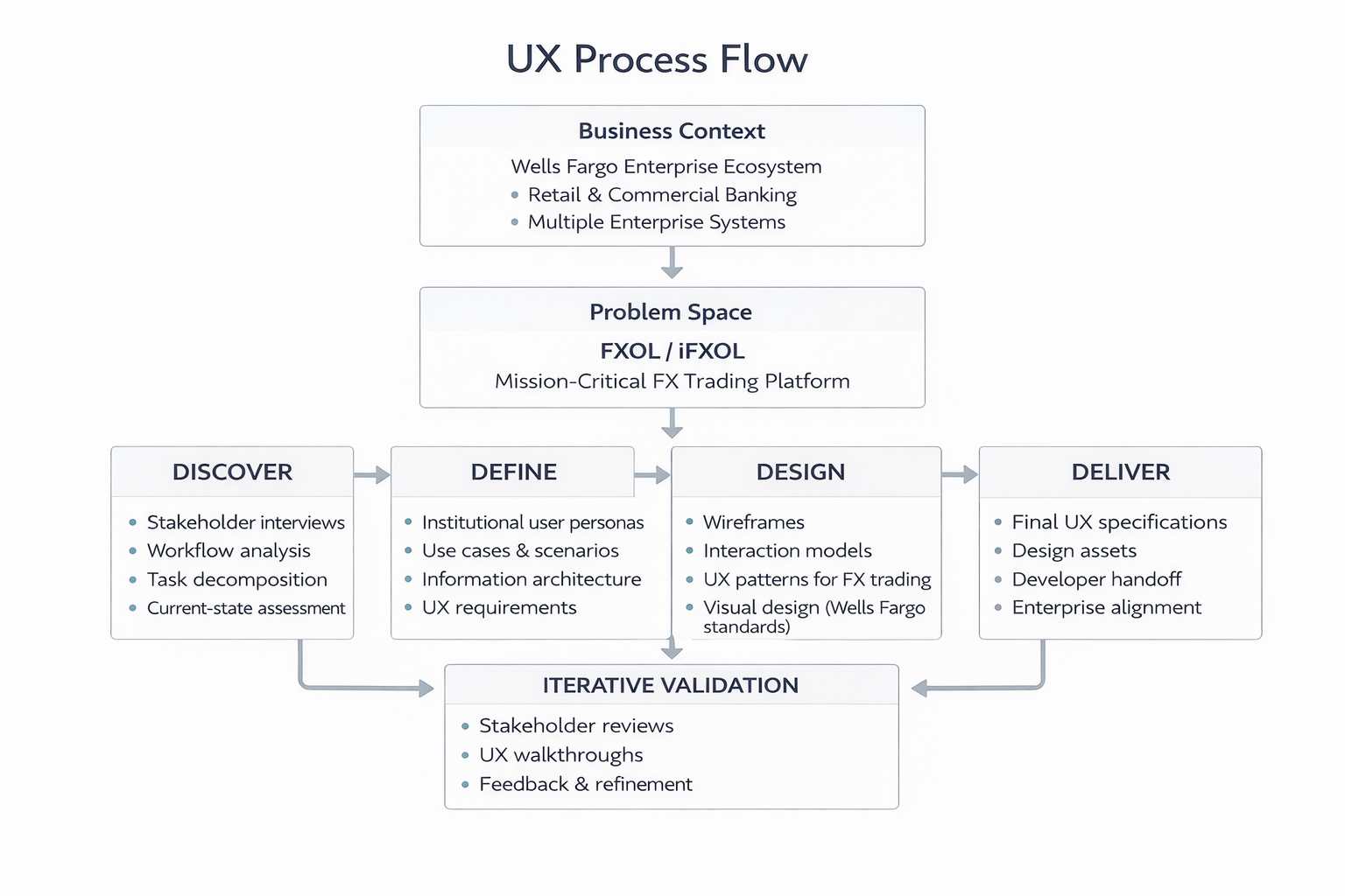
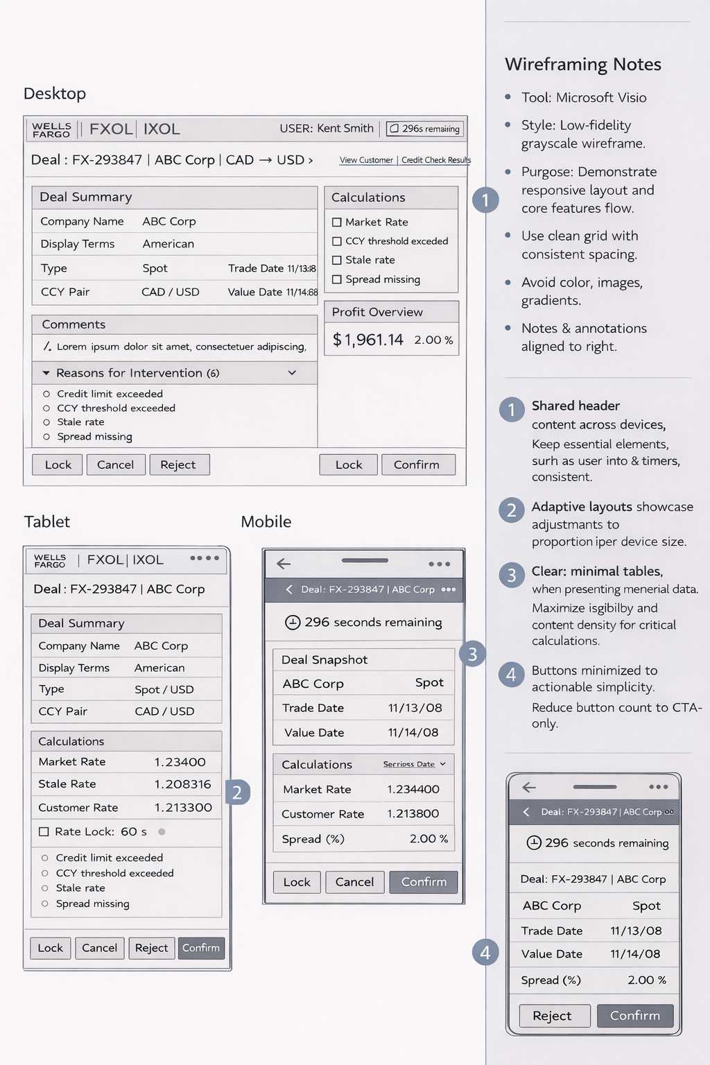
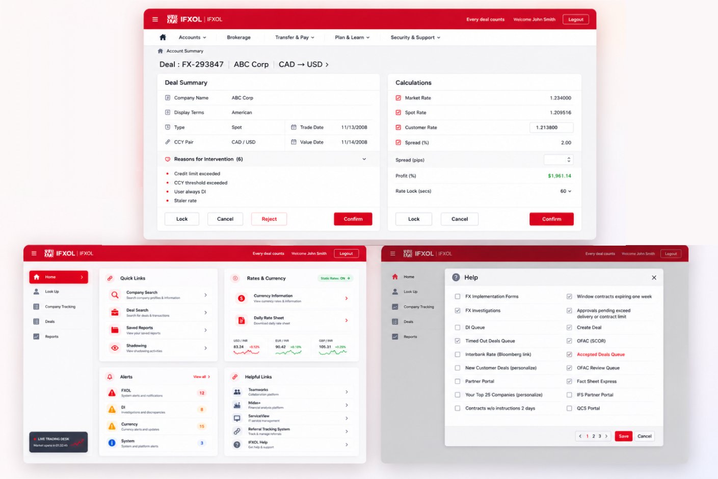
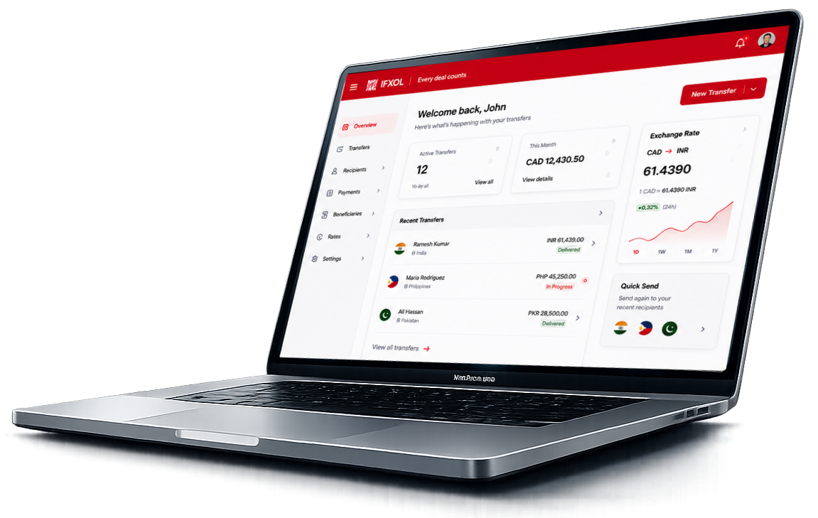
Mission-critical UX redesign for Wells Fargo's FXOL / iFXOL — Foreign Exchange Online — enabling institutional users to perform spot and forward FX transactions, manage currency exposure, and access multi-currency settlement and reporting. The mandate was to reduce cognitive load, standardize interaction patterns, and establish a scalable UX foundation for a regulated enterprise trading platform.

In high-frequency trading, recognition beats recall every time.
FXOL / iFXOL supports institutional users performing spot and forward FX transactions, currency exposure management, and multi-currency settlement. The redesign focused on efficiency, consistency, and a scalable foundation aligned with enterprise standards.
Research focused on how high-frequency FX users actually worked — under real time pressure and across multiple modules — surfacing where memory load was carrying the burden of inconsistent patterns.
Workflow analysis and task decomposition revealed where inconsistency between modules forced users to relearn behaviors. Smart defaults, inline validation, consistent labeling, and logical grouping emerged as the highest-leverage interventions for high-frequency trading screens.
Information architecture rationalization paired with interaction modeling and iterative stakeholder validation established the foundation for a long-term, vendor-proof UX system.
"If two screens behave differently for the same action, I lose seconds I can't get back."
"I want defaults that match how I work — not a blank form every time."
"Show me the calculation, not just the result. I need to trust it before I commit."
Inconsistent modules tax high-frequency users every minute.
Highly complex workflows created high cognitive load for frequent FX users.
Inconsistent screens and interaction patterns across modules slowed task completion.
Business and functional requirements were evolving in parallel with UI redesign.
Need for scalable, long-term UX solutions aligned with enterprise standards.
I owned the application of recognition-based UX principles across FXOL / iFXOL workflows — simplifying layouts, introducing consistent labeling and grouping, and reducing cognitive load for high-frequency users.
The engagement followed a structured 4D (Discover–Define–Design–Deliver) methodology. UX progressed in parallel with business and functional definition — workflow analysis and task decomposition, IA rationalization, wireframing and interaction modeling, visual design aligned to Wells Fargo brand standards, and iterative stakeholder validation.
FX journeys were decomposed task-by-task — surfacing where consistency, smart defaults, and recognition-based UI could remove friction from high-frequency operations.

Every screen, template, and confirmation message was anchored to a mapped moment. Every sign-off verified that the moment had been designed for, not assumed. The journey map was the canonical reference through every design and vendor review.
Low-fidelity, grayscale wireframes for iFXOL articulated complex FX trading workflows across desktop, tablet, and mobile — focusing on information hierarchy, decision-critical data, and responsive behavior over visual styling.

Every wireframe was traceable to a journey moment, and every IA decision was signed off before vendor execution. Storyboards were leveraged to align business, brand, talent acquisition, compliance, and vendor teams on what each moment had to feel like — before any pixels were committed.
Pricing · Execution · Ledger — institutional FX in three surfaces
Reusable layouts, consistent labeling, smart defaults, and inline validation — encoded into a UI foundation that could extend across the FXOL ecosystem without repeated redesign.

Standardize the patterns. Free the users.
UX standards governed module-level consistency — turning a fragmented platform into a predictable system where high-frequency users could trust every screen.
Core UX standards and risk controls were centrally maintained, while implementation remained flexible at the domain level. Governance was lightweight and embedded into delivery workflows, focusing on systemic risks — accessibility, regulatory compliance, brand integrity, apply-flow friction — rather than surface-level design. Continuous improvement was driven through analytics and shared learnings.
Iterative validation with Wells Fargo stakeholders refined patterns under real workflow constraints — ensuring usability improvements held up under time-sensitive, regulated trading conditions.
Role pages restructured so candidates established relevance within seconds. Headline, signal-bearing tags, and growth indicators surfaced before scroll.
Filters and sorting logic refined to align with the criteria candidates actually used — not the criteria the platform exposed by default.
Content hierarchy and CTAs improved so candidates entered the apply flow knowing what to expect. Confirmation messaging validated to reassure on submit.
Insights translated into refinements before launch — reducing rework during vendor implementation and surfacing systemic issues that would have appeared only post-release.
The redesigned FXOL / iFXOL platform improved usability, reduced cognitive load, and established a consistent interaction framework across modules — strengthening MphasiS' positioning as a strategic UX partner.

An inconsistent enterprise trading platform became a recognition-based system — design moved from module-by-module fixes to standardized patterns.
Reusable layout structures, consistent labeling, smart defaults, and inline validation gave FXOL / iFXOL a UX foundation that could absorb future enhancements without renegotiating the fundamentals. Recognition replaced recall, standardization replaced inconsistency, and high-frequency users got back the seconds they had been losing to fragmented patterns.
Modernizing enterprise trading UX while requirements evolved in parallel taught durable lessons about pattern discipline and recognition-based design.
High-frequency users compensate for inconsistency with memory — and memory has a ceiling. Recognition-based patterns paid back every minute they cost to design.
Module-level pattern consistency unlocked compounding gains. Fixing individual screens treated symptoms; fixing patterns treated the cause.
Because requirements evolved in parallel with the redesign, the UX foundation had to be vendor-proof and extensible by default. Reusable layouts and components carried the redesign past the engagement.
Smart defaults, inline validation, and logical grouping accelerated experts while staying learnable for newcomers — the platform served both without compromise.